
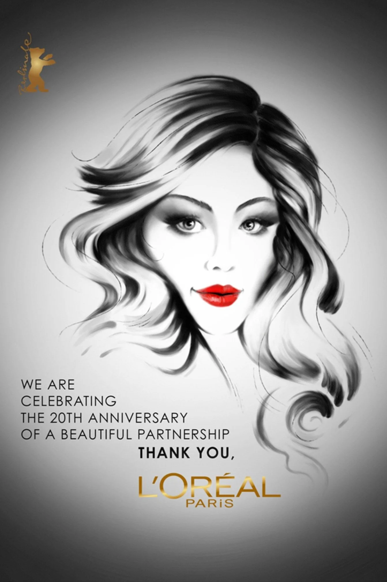
“Berlinale & L'oréal 20th Anniversary” ad and poster campaign. A project creatively coordinated and directed together with the Berlinale Festival + L’Oréal and its Festival Journal Magazine. More info about this work collaboration, HERE.

The book novel, “Tassilo der Mumienabrichter”. A project art directed, managed, designed and fully illustrated.
Getty Images
Miscellaneous works done together with Getty Images, a global visual media company. All these examples showcase a focus on art direction, direct project management and graphic design applied together with commercial illustration. Complete marketing and visual communication supervision and execution were applied on all these projects and more, in order to meet the fixed deadlines and budgets, coordinating and managing myself with the local german office and the Getty Images corresponding offices in the UAE, among others countries.
From White Paper documents, Insider Business reports, internal e-Magazines like CURVE, etc.
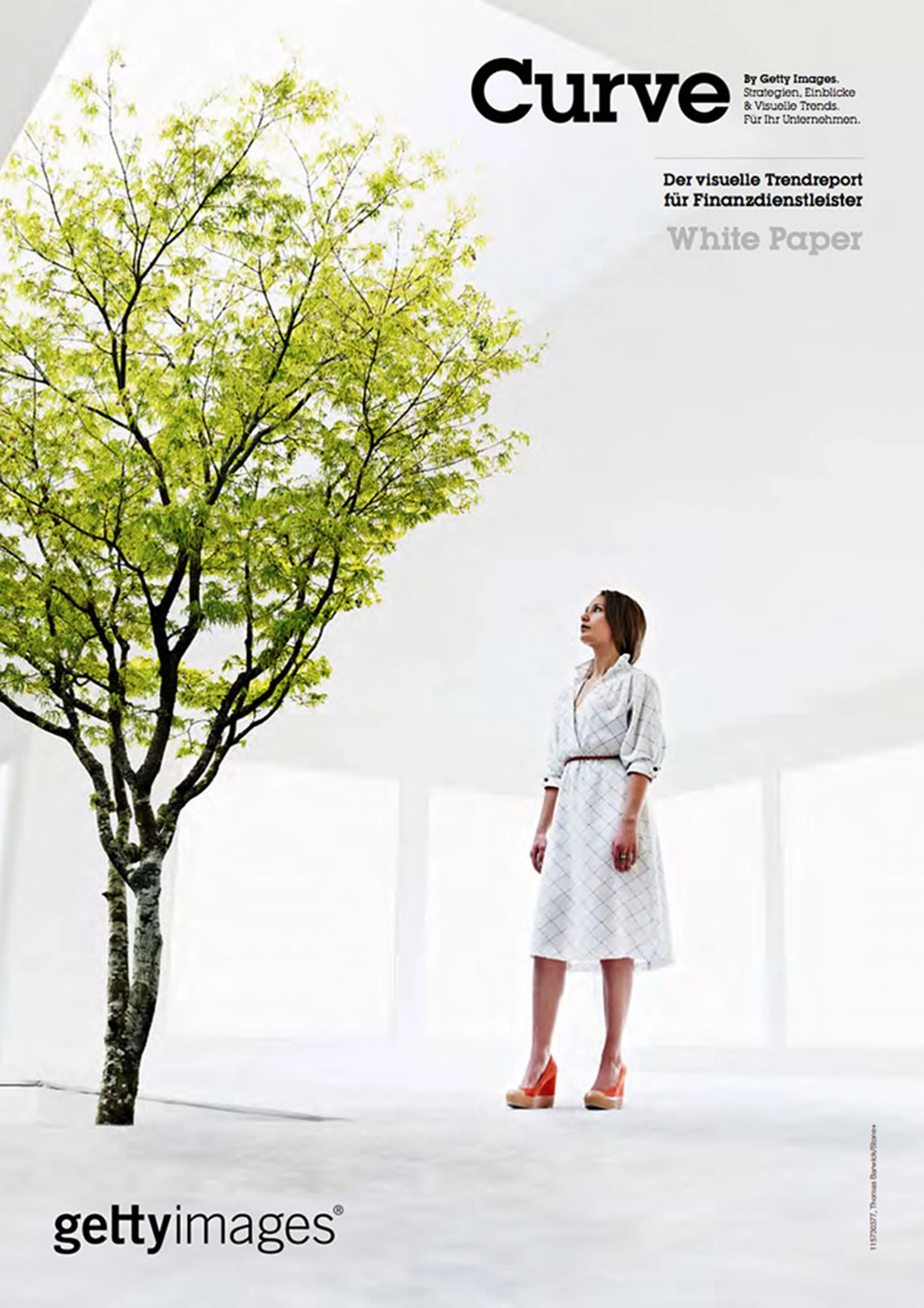
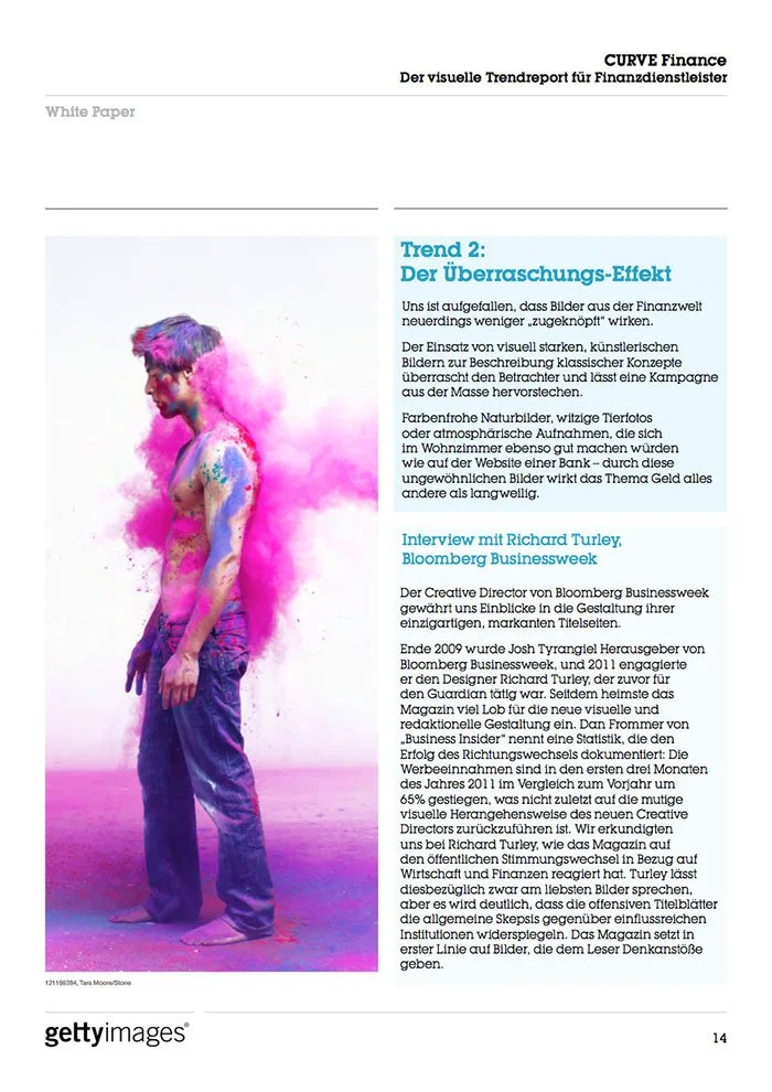
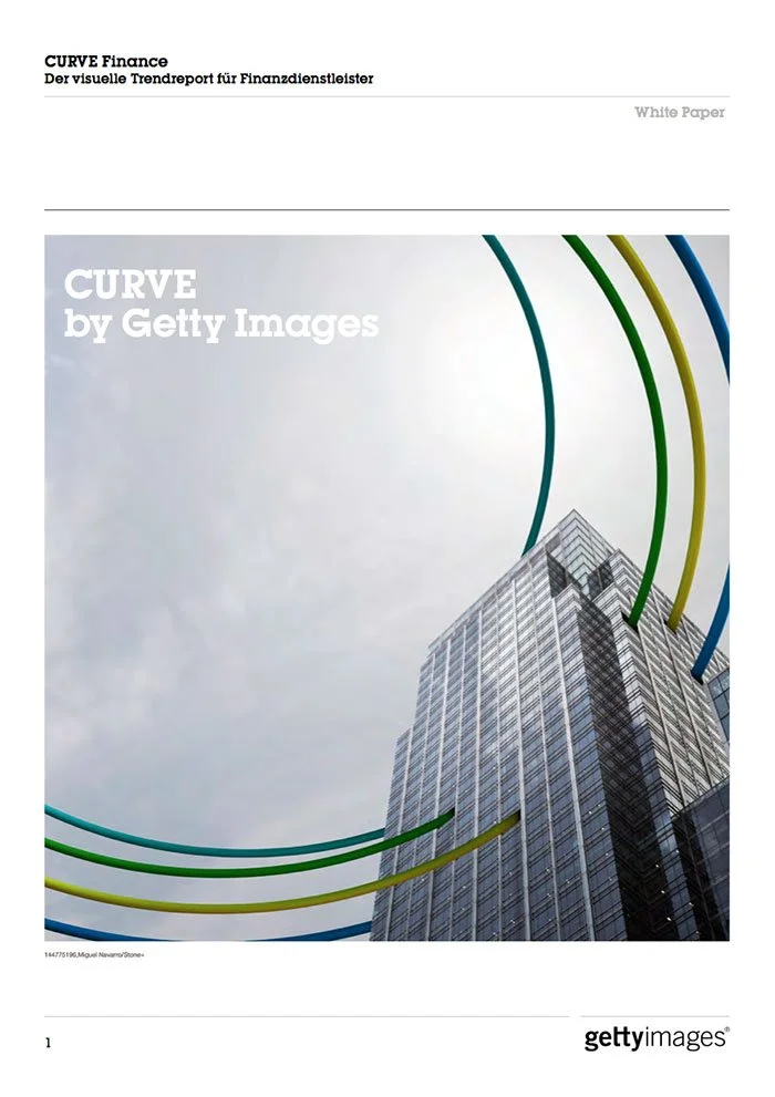
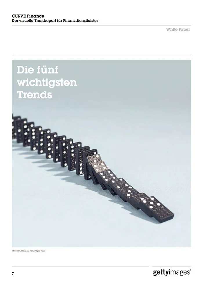
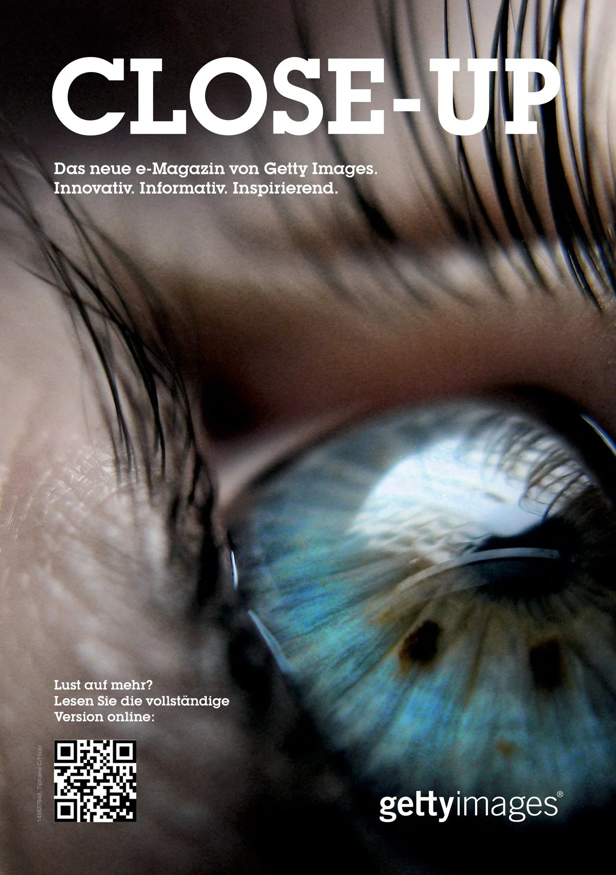
“CLOSE-UP” e-magazine, entirely designed, art directed and managed together with Getty Images Germany. The original german magazine was called “Ganz Nah Dran”.
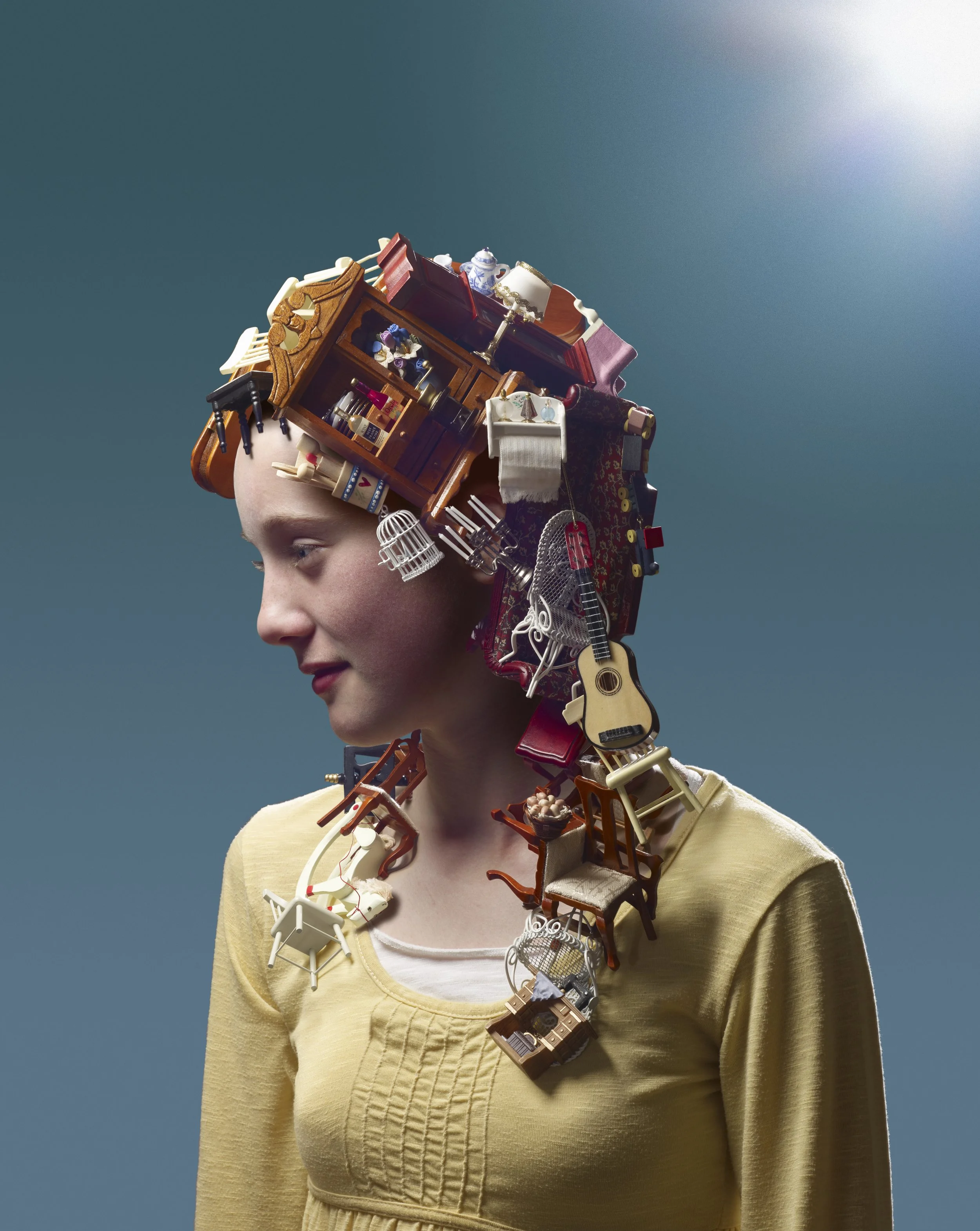
Curation of images
It was often the case that I needed to go through the extensive collection of media from Getty Images and curate the images needed for both internal and external communications.
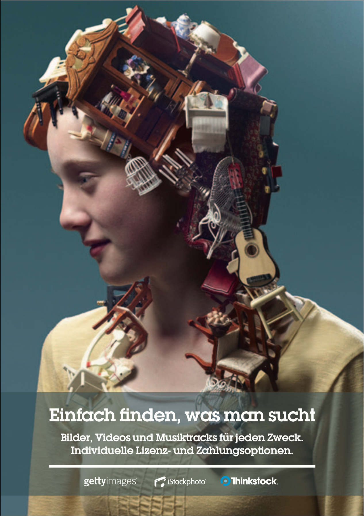
Example of the final layout design, based on the Getty Images corporate’s guidelines, using the final curated image.
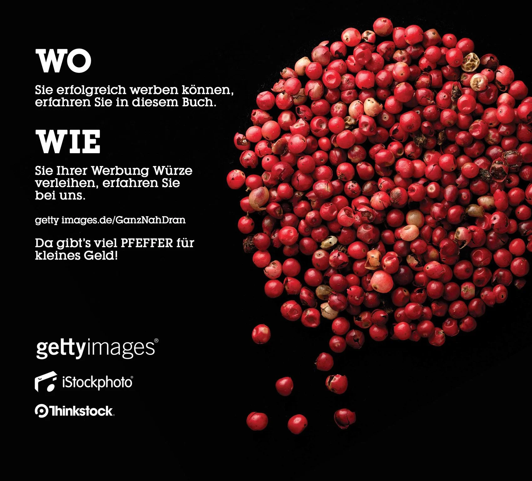
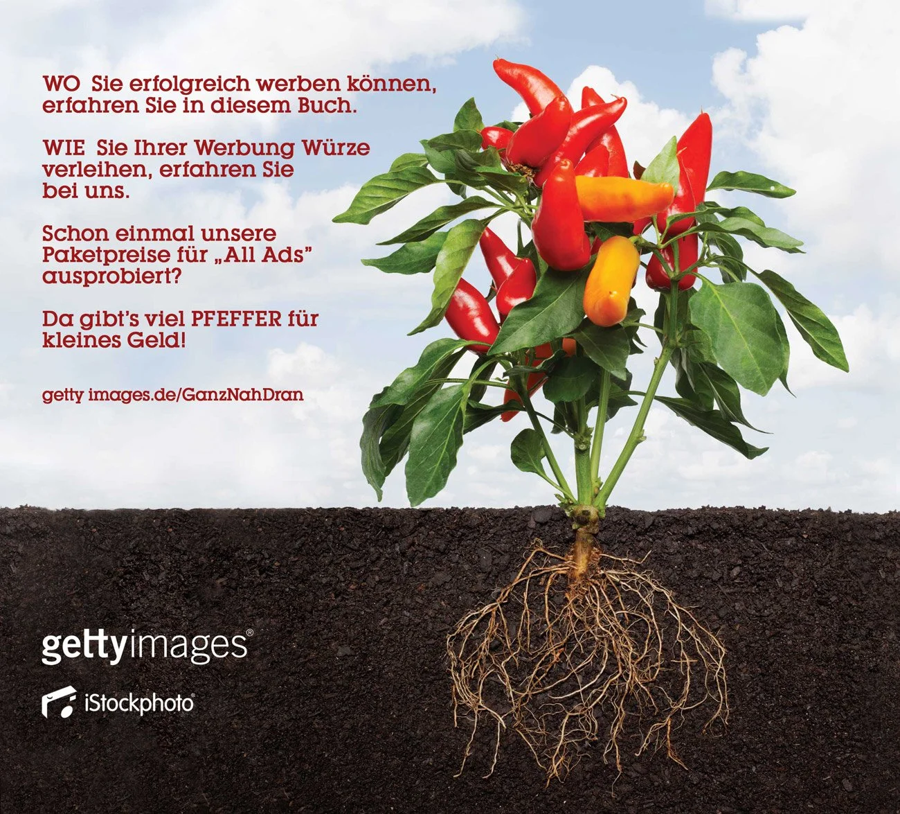
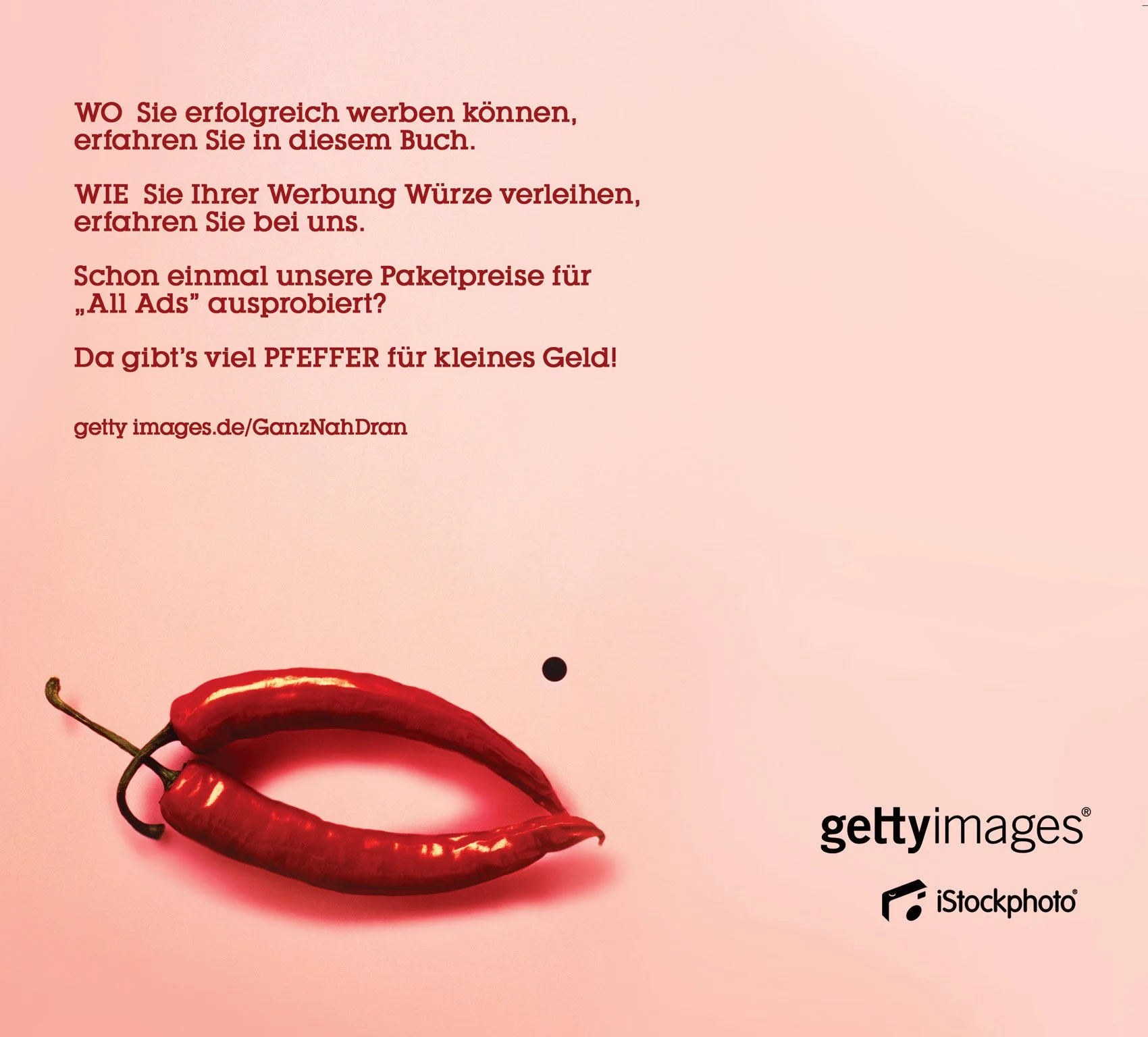
Online presence, website content supervision and design, besides booth design for the brand following it’s brand guidelines for corporate visual communication for events around Germany and other countries.
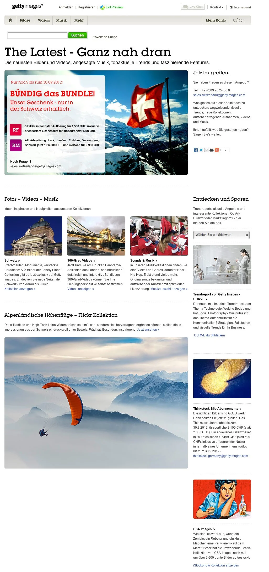
Full art direction and design-layout for the Swiss division of Getty Images’s homepage.
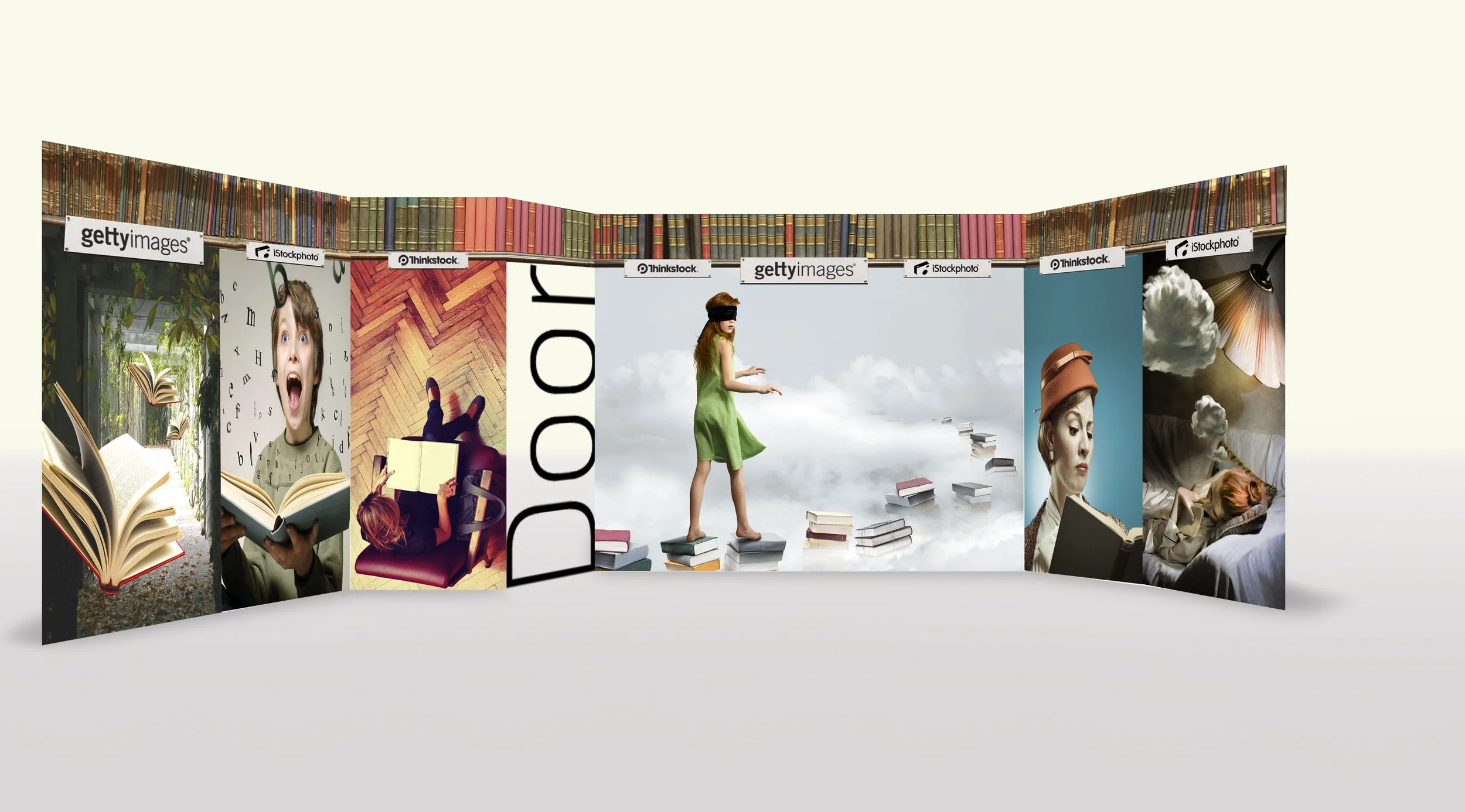
Part of the art direction and design efforts where for the many different events where Getty Images was present, such as fairs, etc., was the design and printing of promotional material and stands. Here a model for an event’s booth.
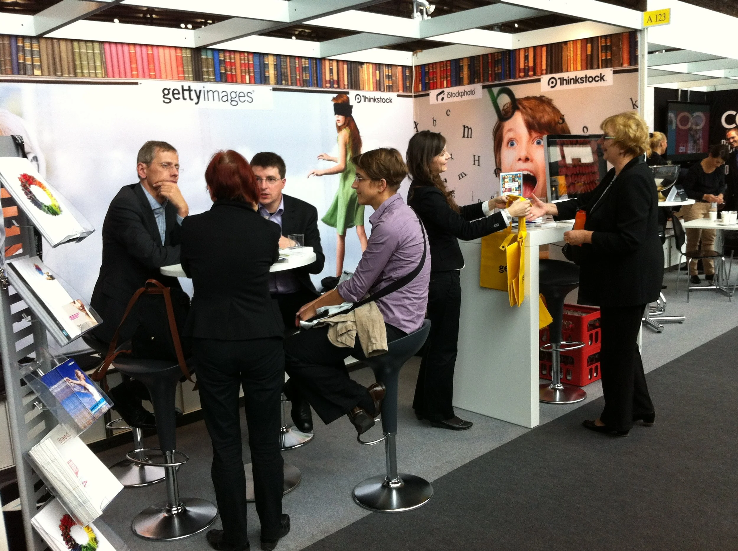
The adaptable designed booth being used at the Frankfurter Buchmesse.
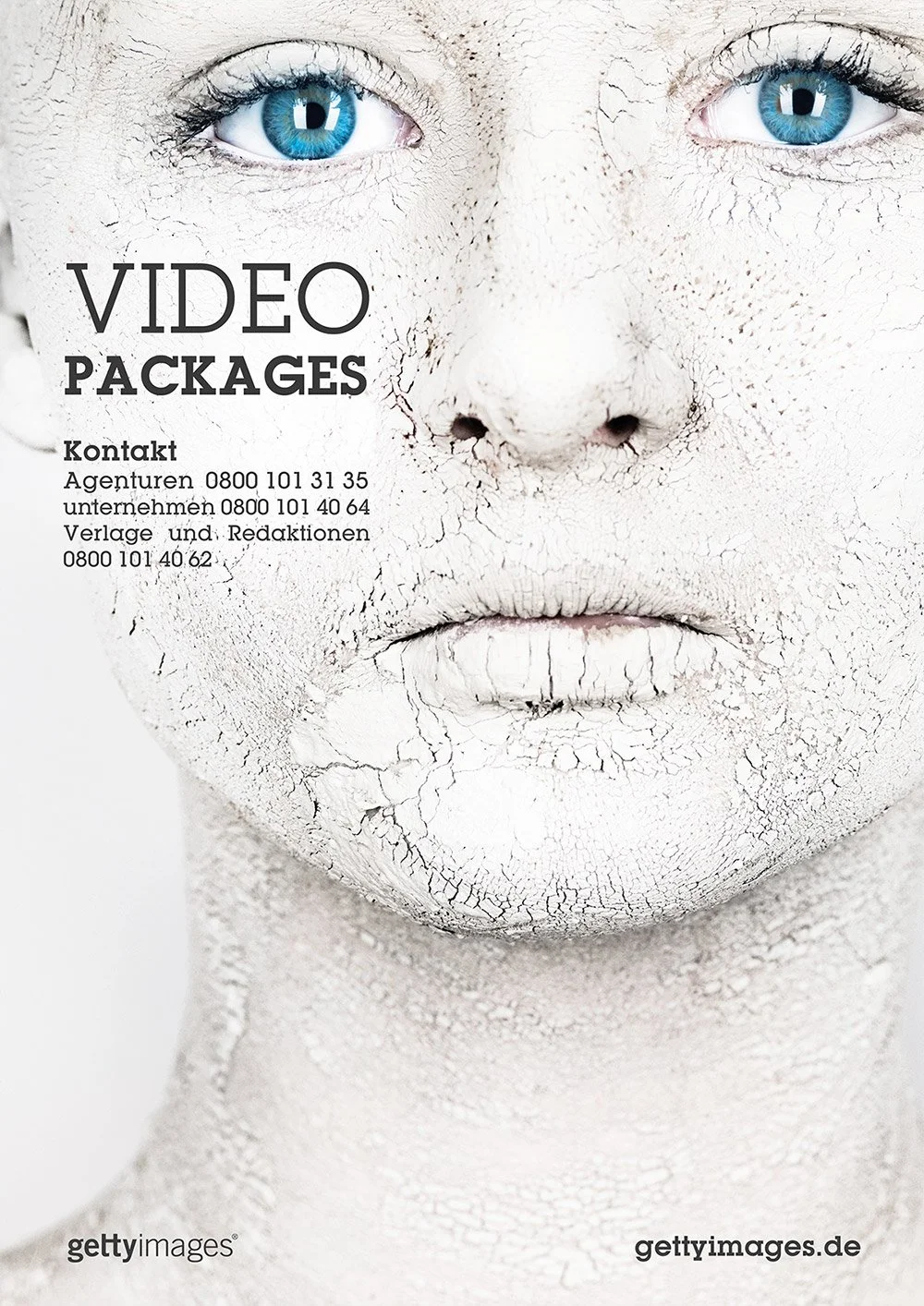
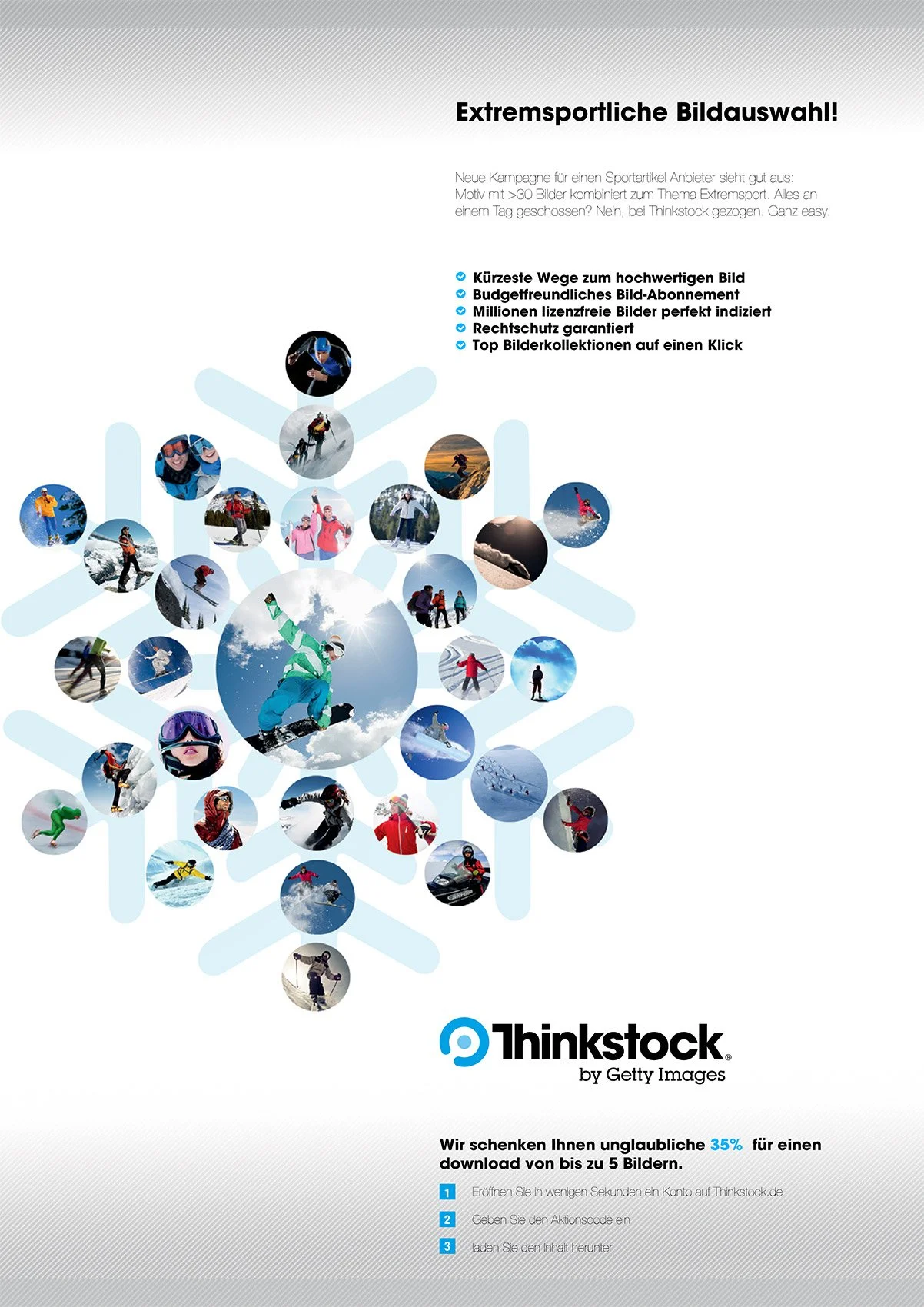
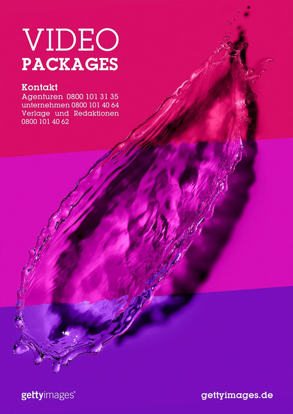
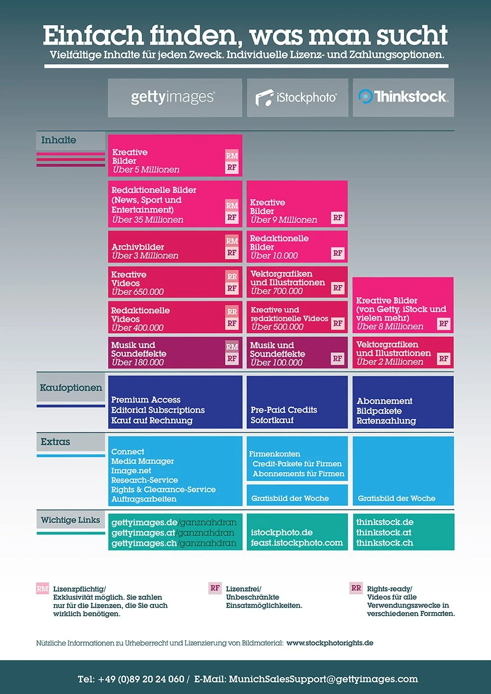
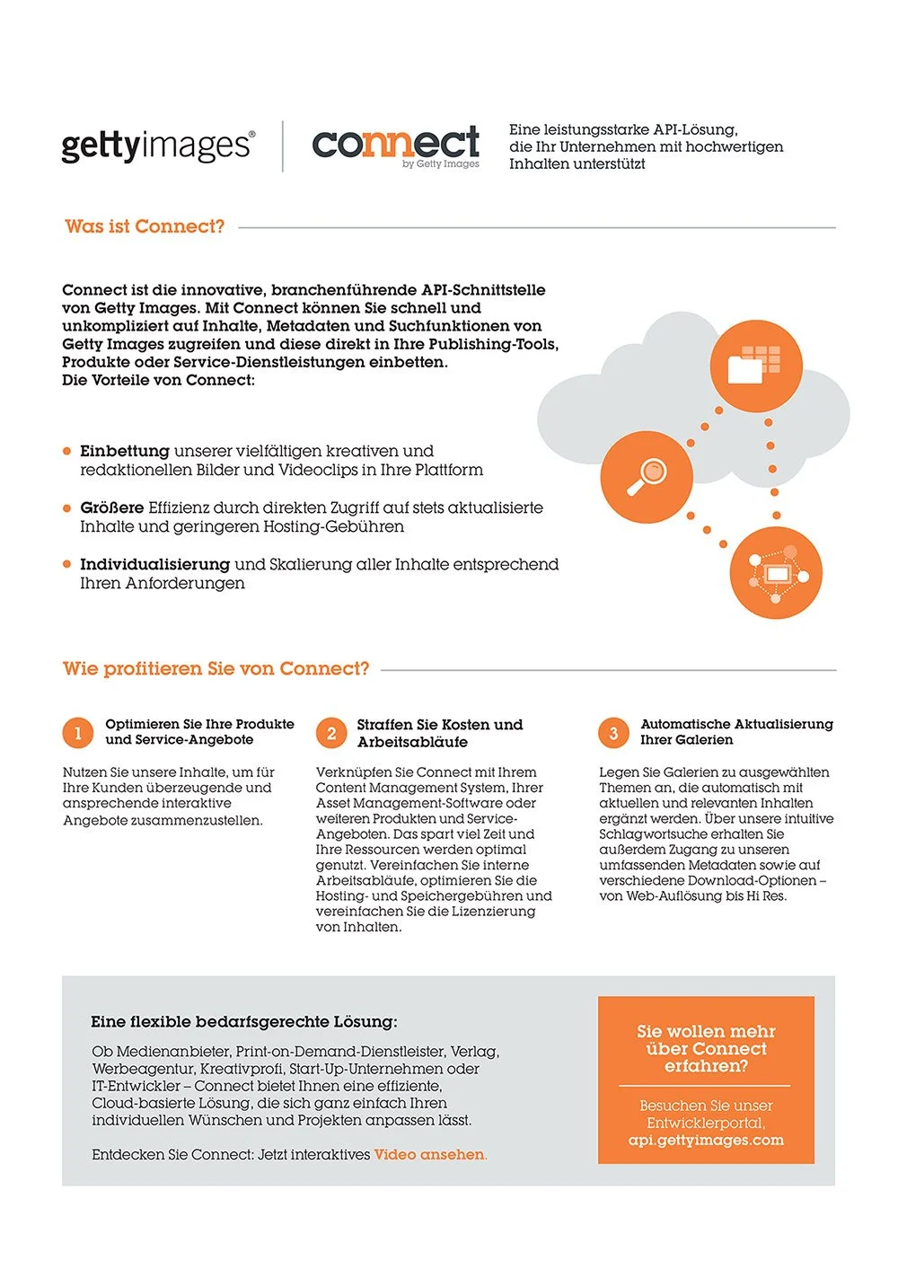
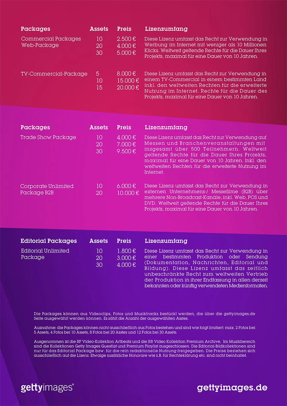
Online content, t-shirt design and collateral promotional and informative pieces
These were fully art directed and designed for the brand’s online and offline presence and promotion, specially for events like marathons or live fairs like TYPO and the Frankfurter Buchmesse, etc.

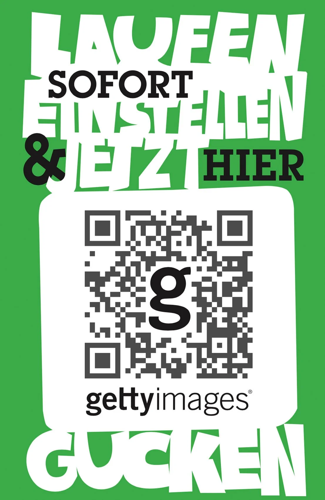
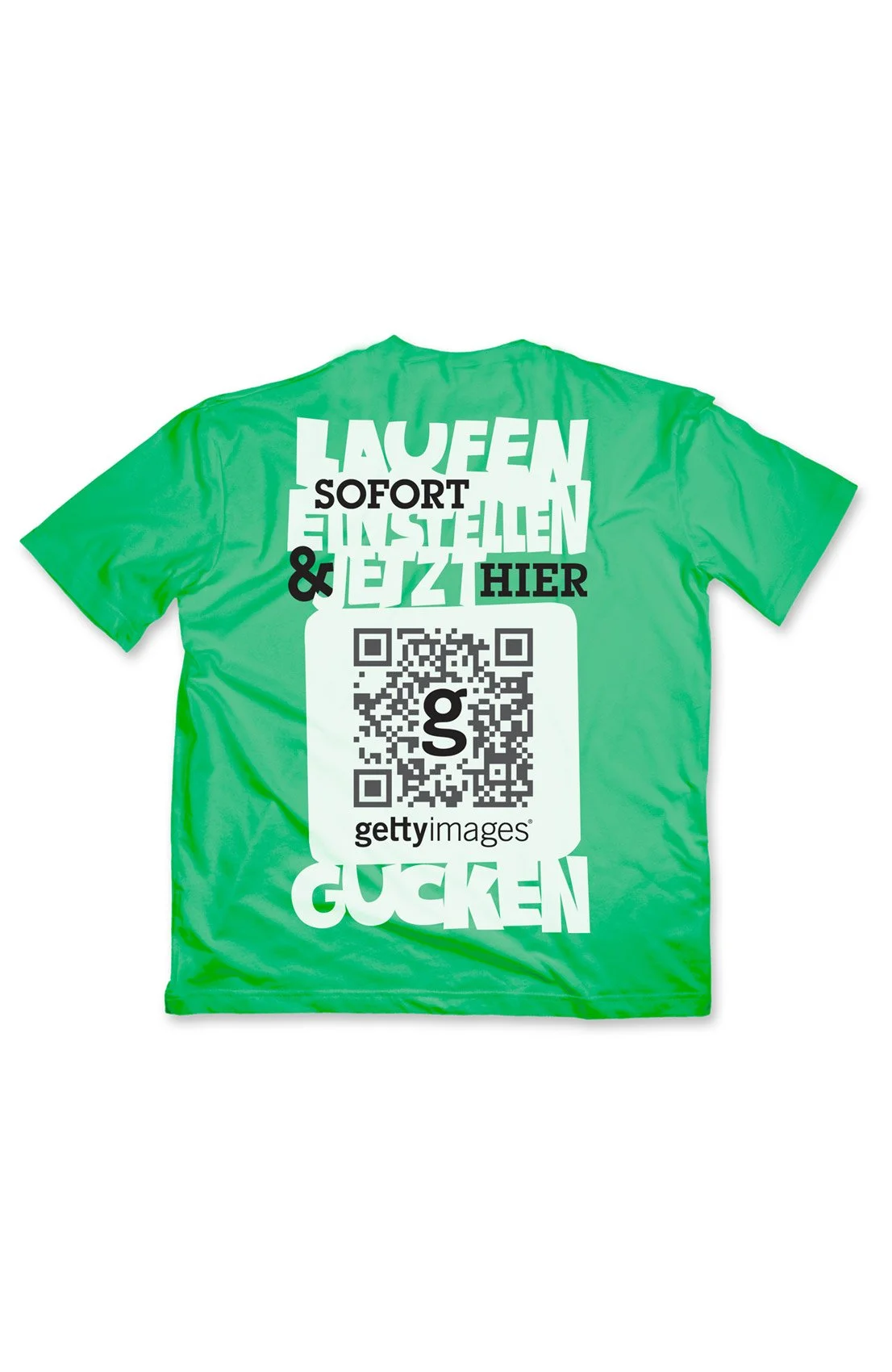
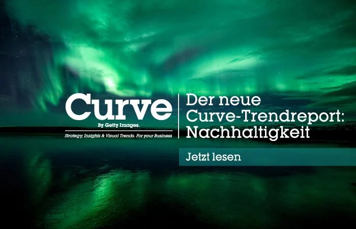
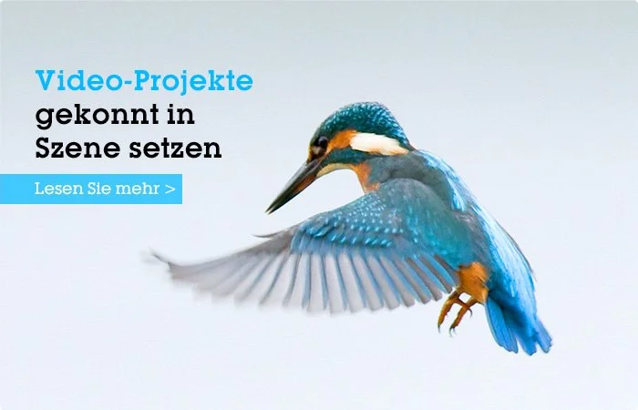
Designed, coordinated and adapted marketing campaigns. These were designed and illustrated in-house for later introduction into other markets for Getty Images like in Germany itself, Switzerland, Austria, the United Arab Emirates, Turkey, etc.
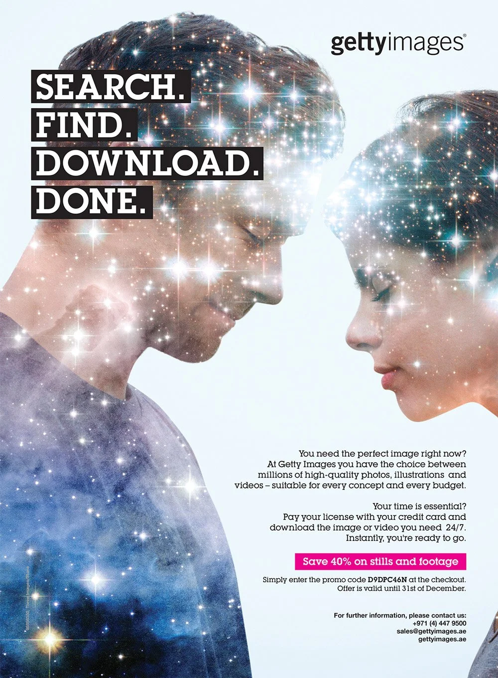
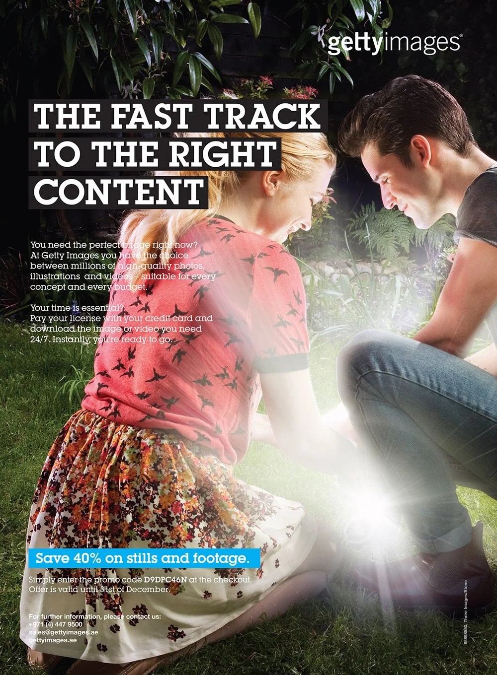
Curation of images for its corporate usage for Getty Images and its brands, such as iStock and Thinkstock.
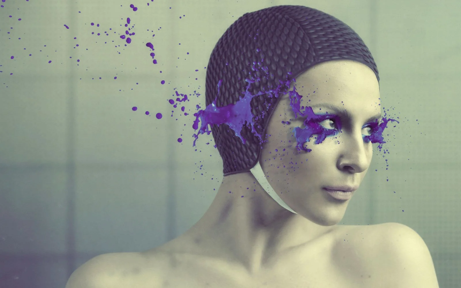

More examples of image curation for Getty Images and the brands belonging to it.
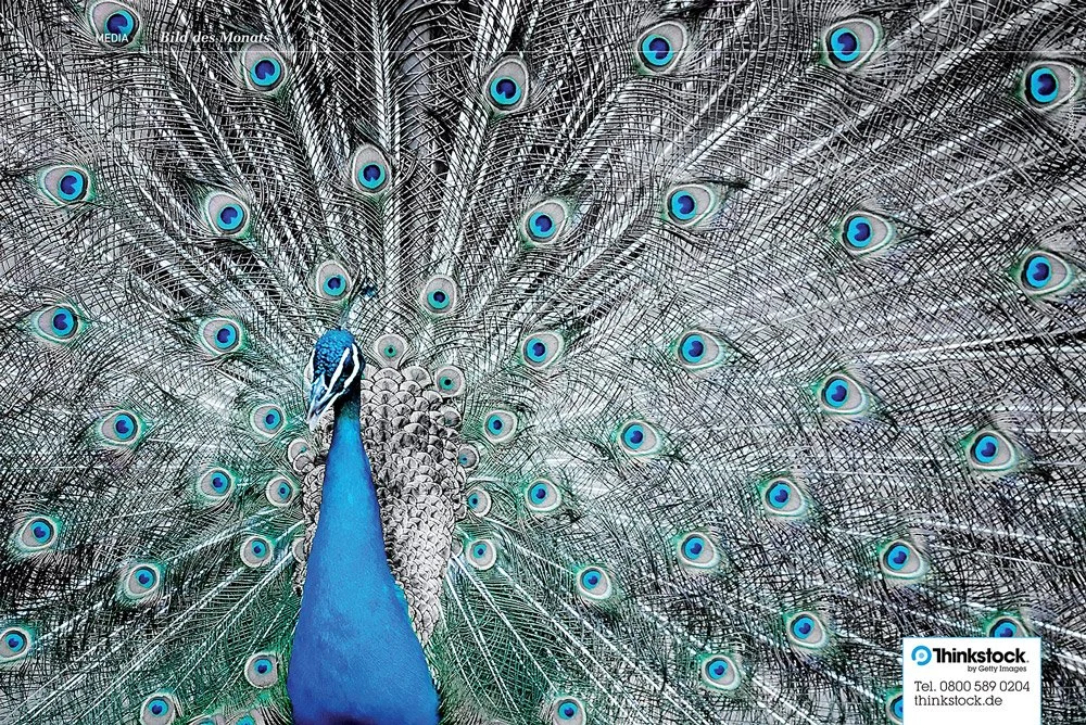
“Bild des Monats”, Image of the Month, selected image among thousands for Thinkstock, that belongs to Getty Images.
LUXENTER
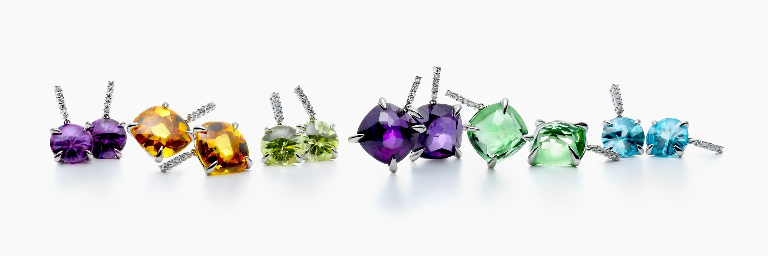
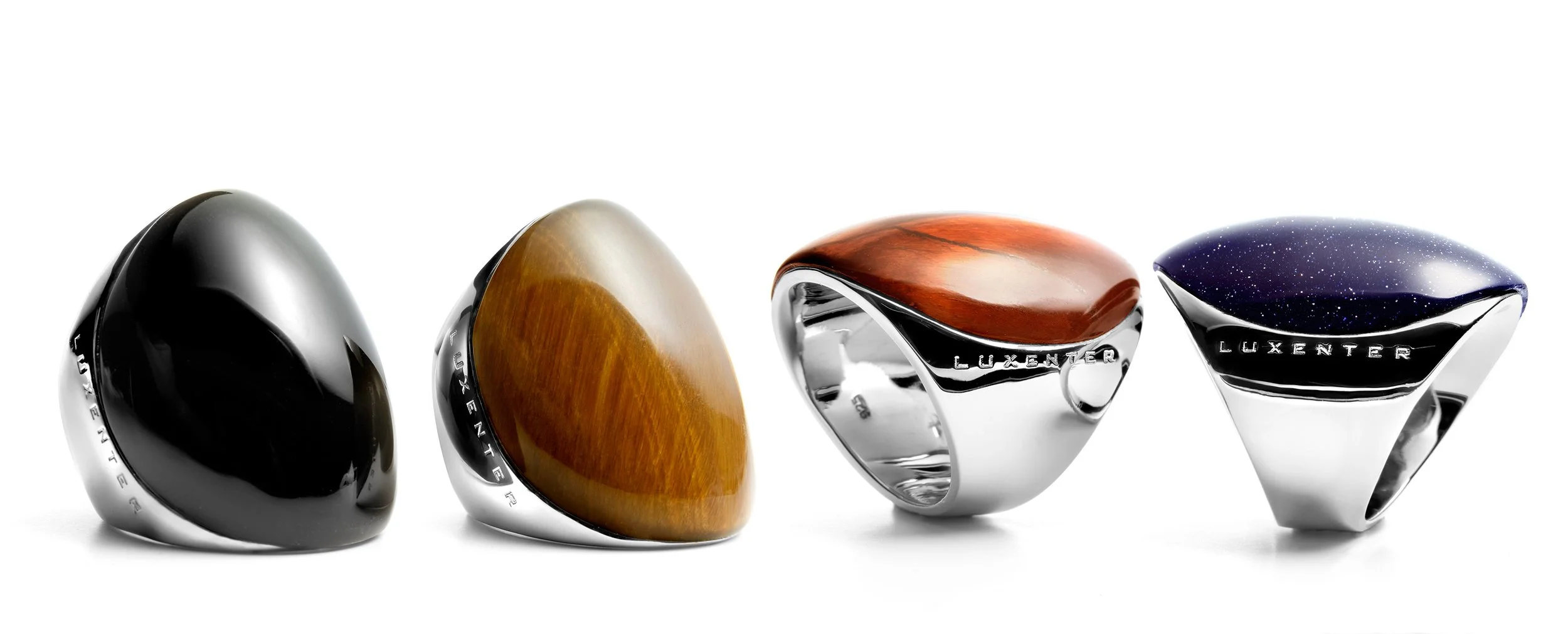
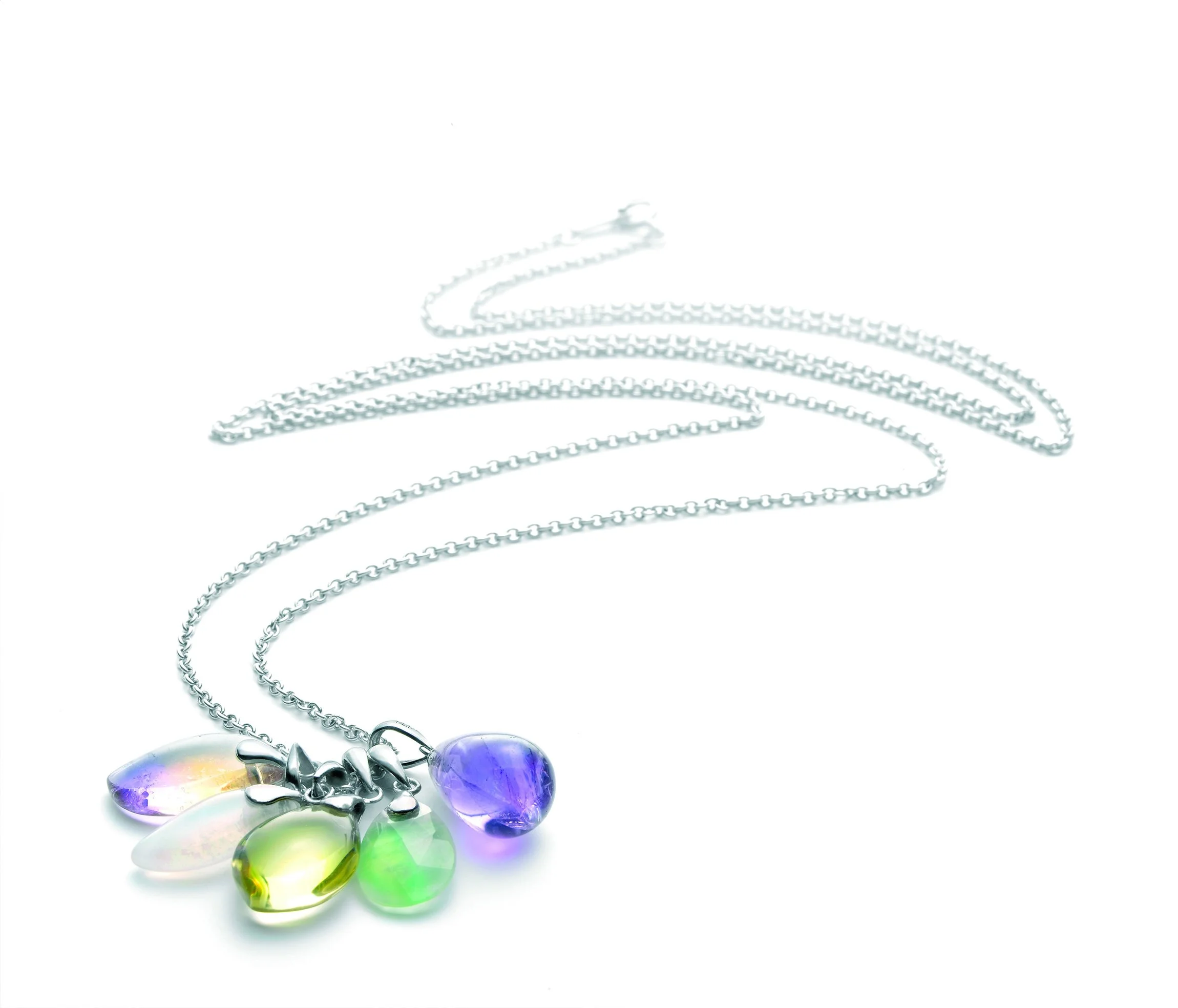
Visual review of the work done while working in Luxenter, a jewellery firm based in Madrid, Spain. I was in charge of the art direction and design of the “charms” inspired collection called at the time, “Chic Chic”. Also worked on the brand’s various jewellery catalogues, photographing and curating gemstones and designed jewellery pieces for later on digital work/enhancement for online/print various usages, making as a well a curation of the model’s photoshooting promotional images. The whole process was coordinated with the print house and the jewellery’s marketing team, simultaneously designing all the promotional + branding materials.
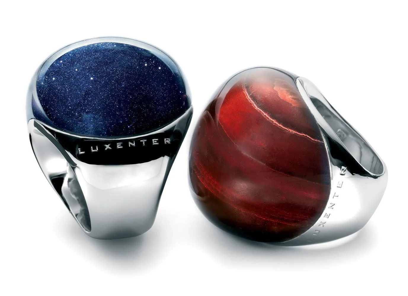
Photography arrangement of rings of the DUMA-TAU collection, after their digital correction/enhancement for online and offline usage.
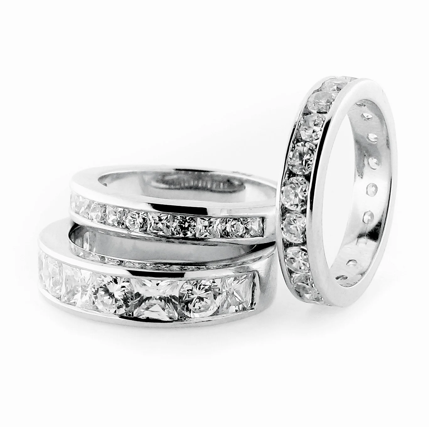
curation & photography
Careful curation from within a large collection of “semi” + precious jewellery pieces for photographing them under special conditions.
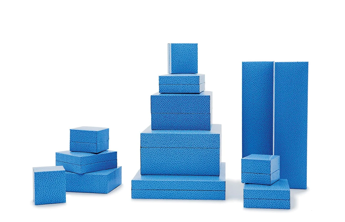
Display props for jewellery’s support
Different display elements, such as jewellery boxes which constituted an important part of the Brand’s visual communication through varied catalogues, corporate and marketing communication etc. It was also photographed under specific conditions + camera equipment for it’s later on the digital final processing.
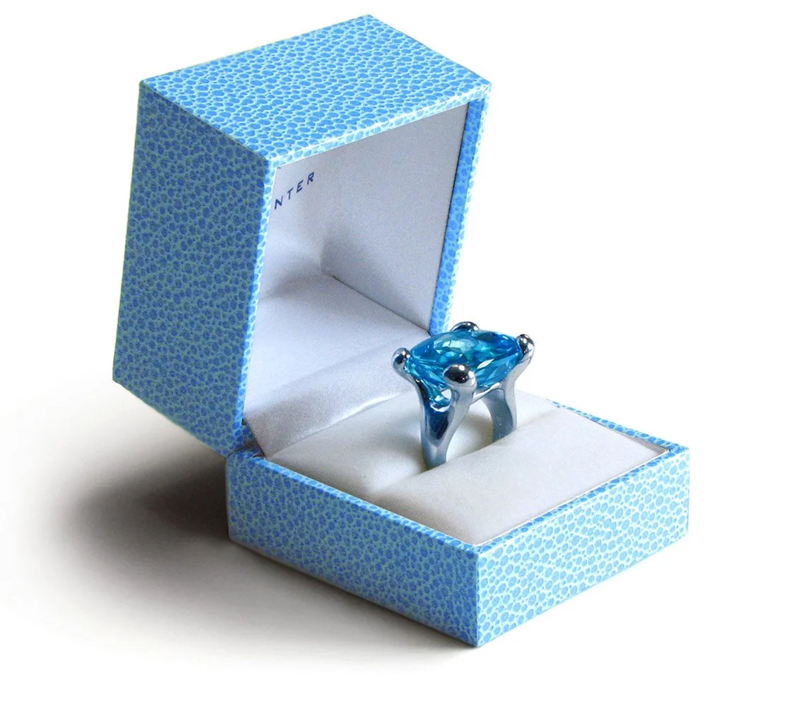
display’s photos
From jewellery boxes and other prop elements were also used keeping the Brand’s style.
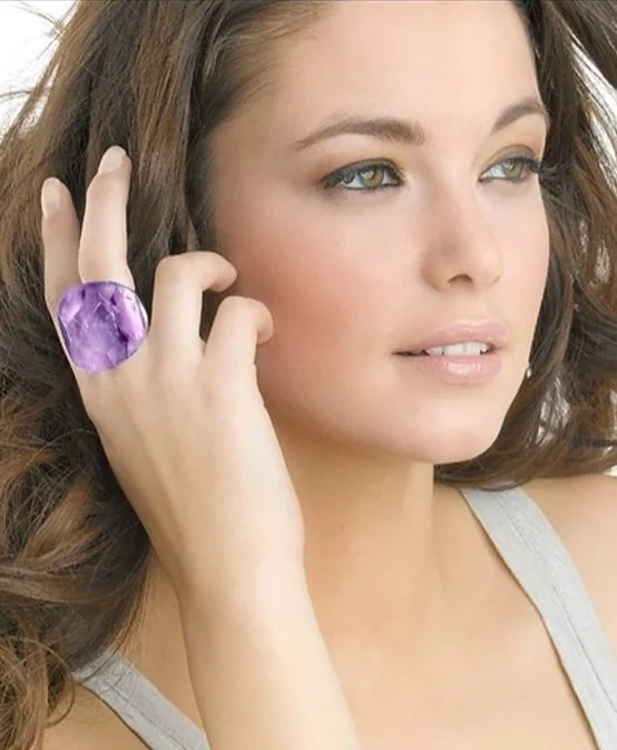
Model’s photoshooting
Supervision and digital correction/enhancement of images of models from their respective photoshootings sessions. These were later on used for many displays of the jewellery on stores all over Spain, as well for catalogues of the Brand and promotional online media.



Further examples of the Brand’s jewellery.
All photographed for it’s later use in internal communication and marketing efforts and jewellery international events and fairs.
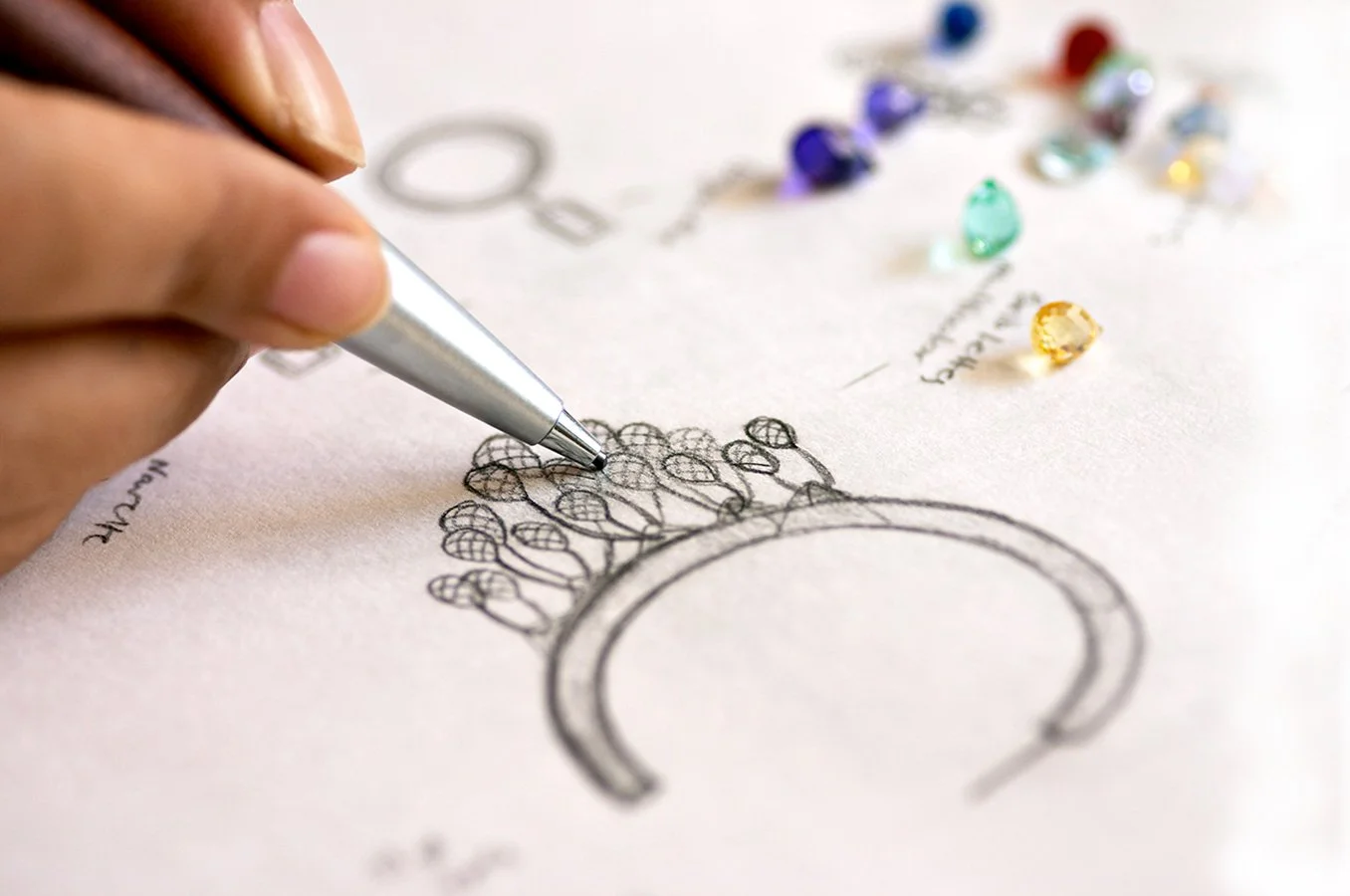
Promotional image depicting the jewellery design process.
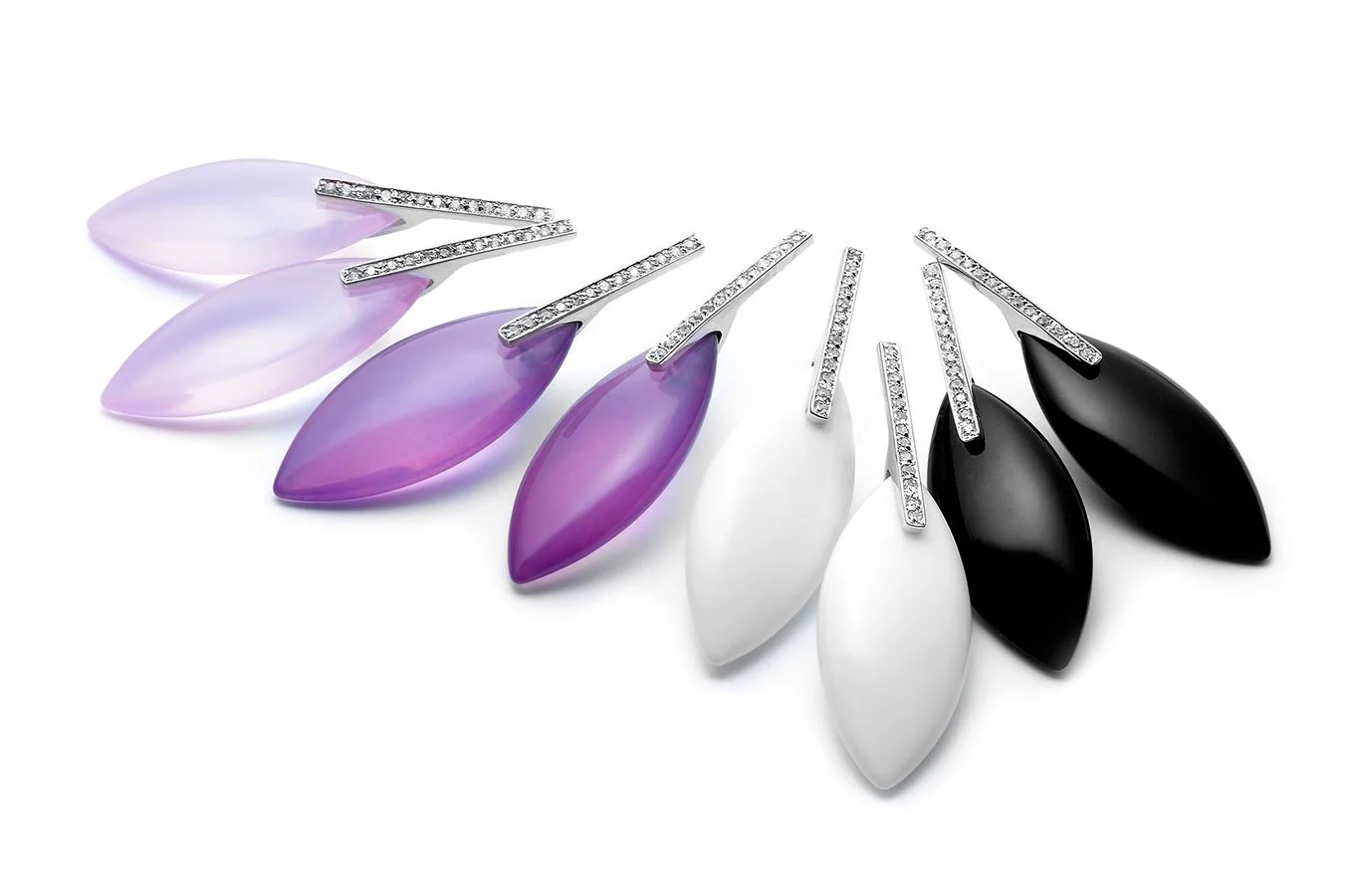
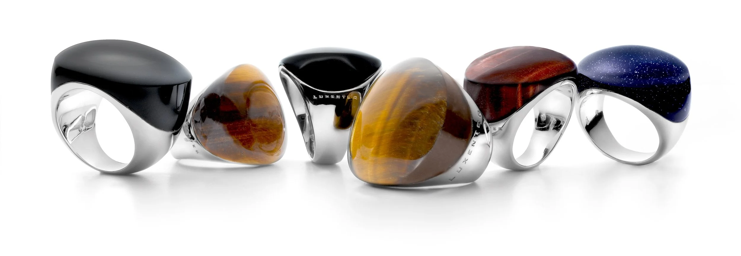
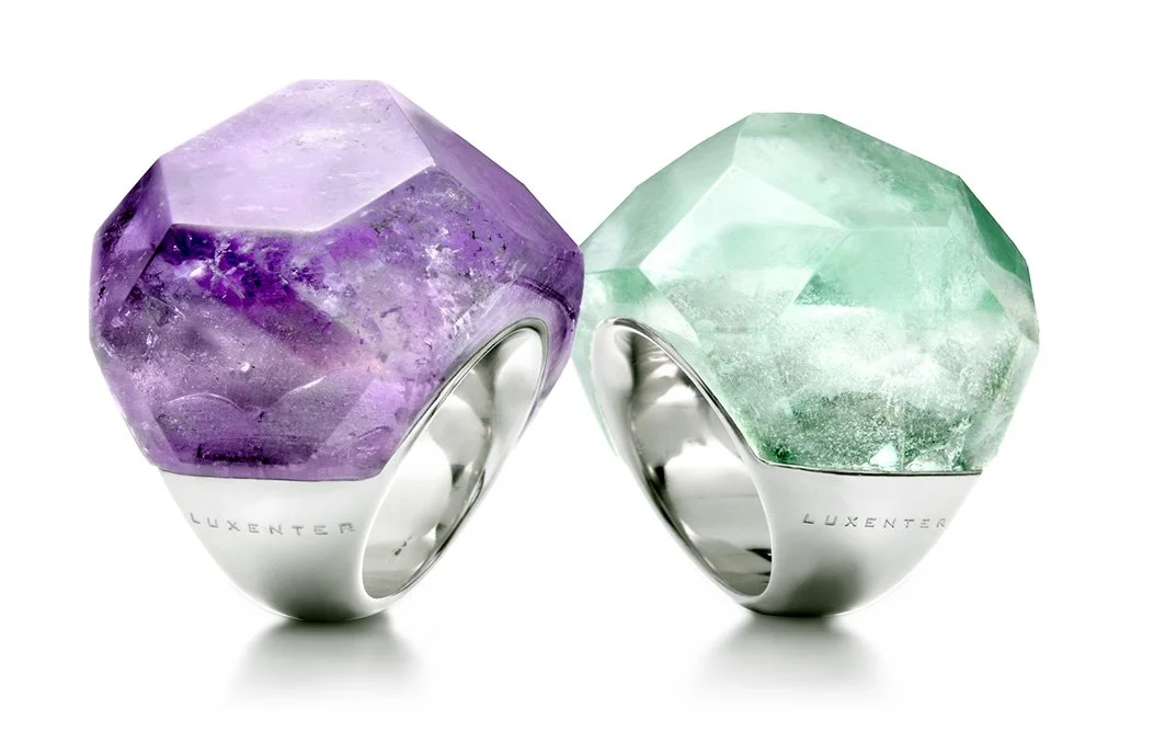
After a careful curation and digital work on the images, these pair of rings were selected as the main representatives for that period’s collection.
Jewellery catalogue & branding guide
Some of its internal pages, displaying the main image chosen for that season collection, among the already curated images of models, gemstones and display support within its pages.
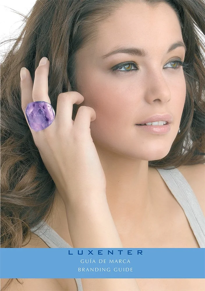
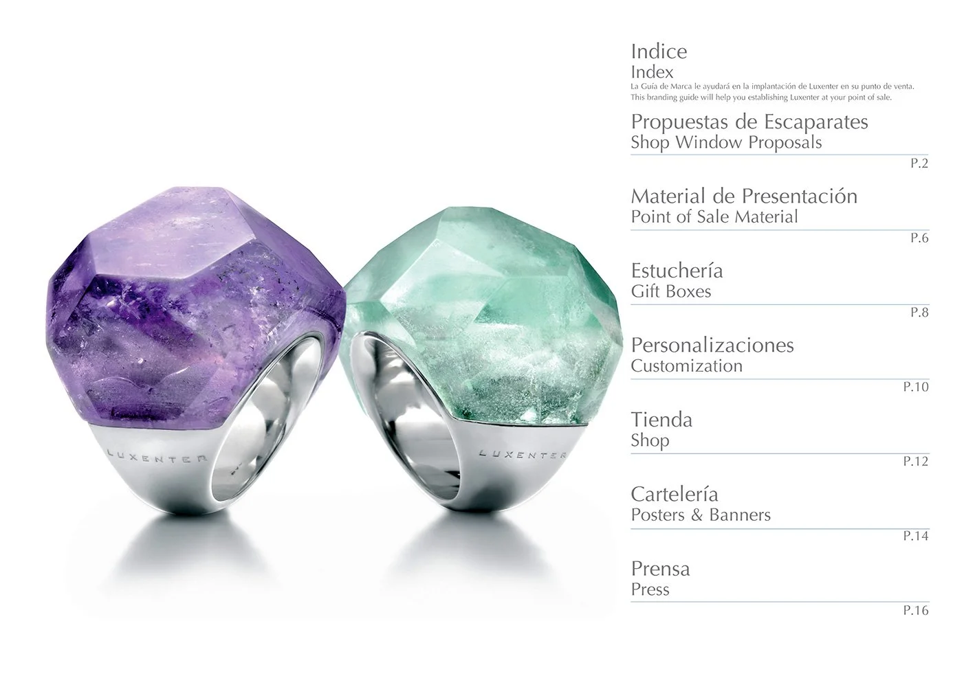
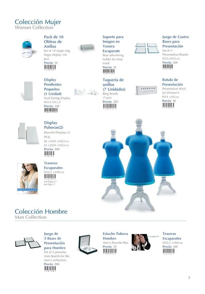
The “CHIC CHIC” Collection
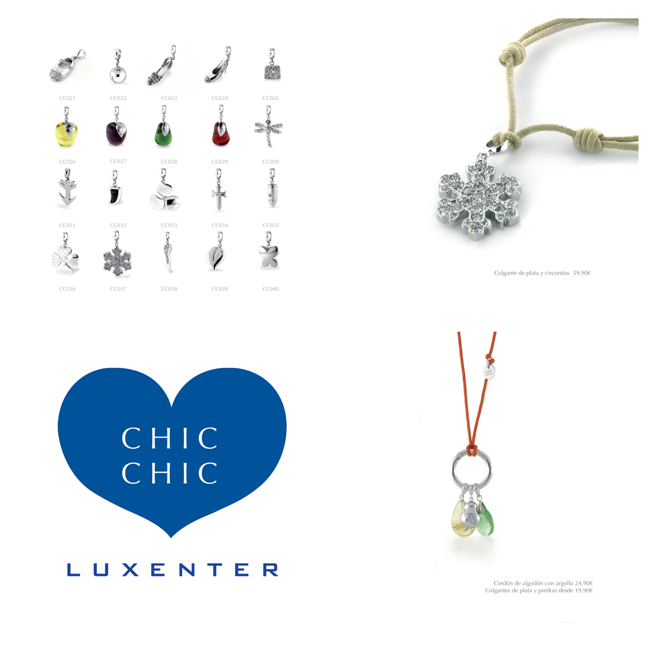
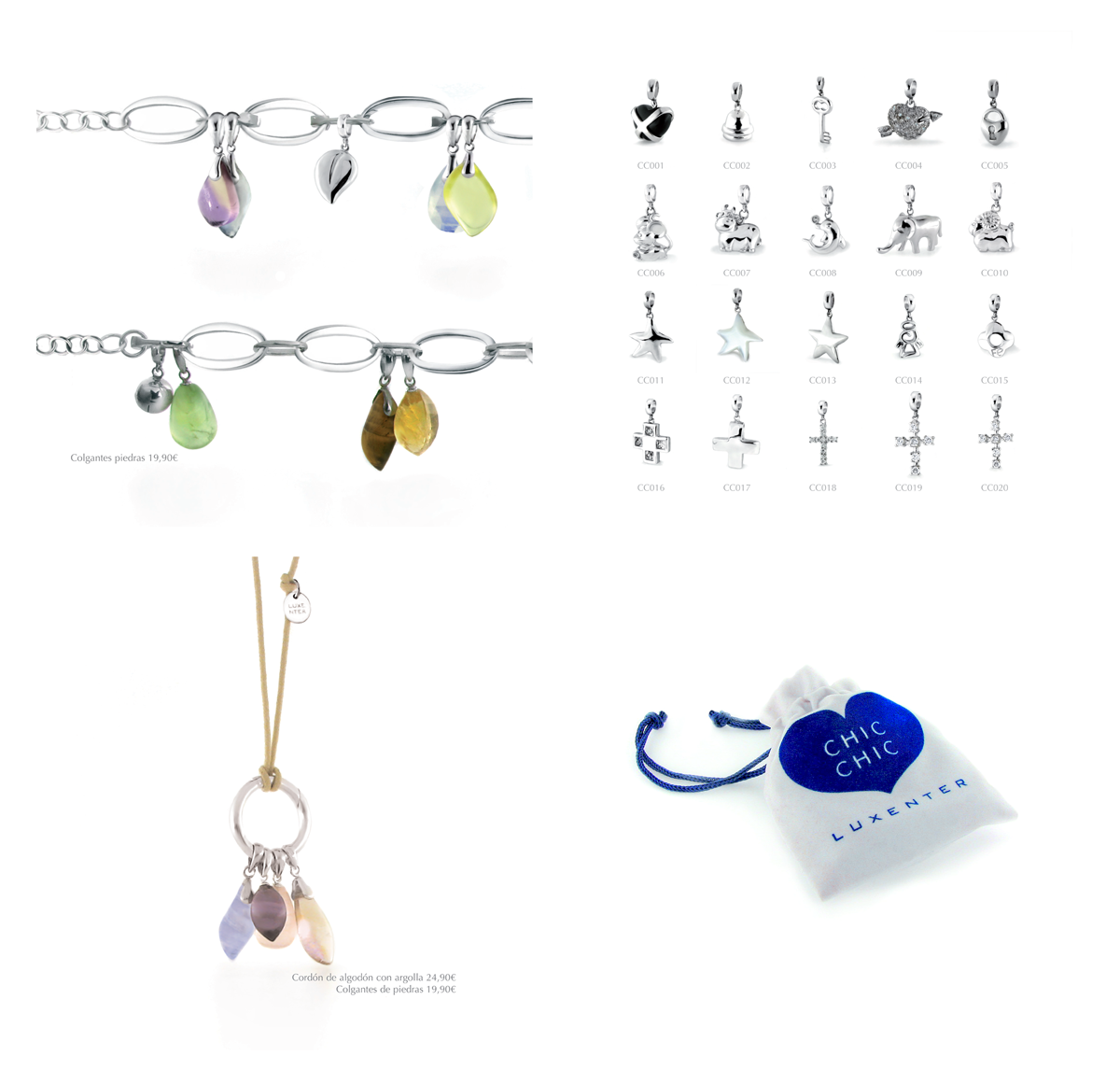
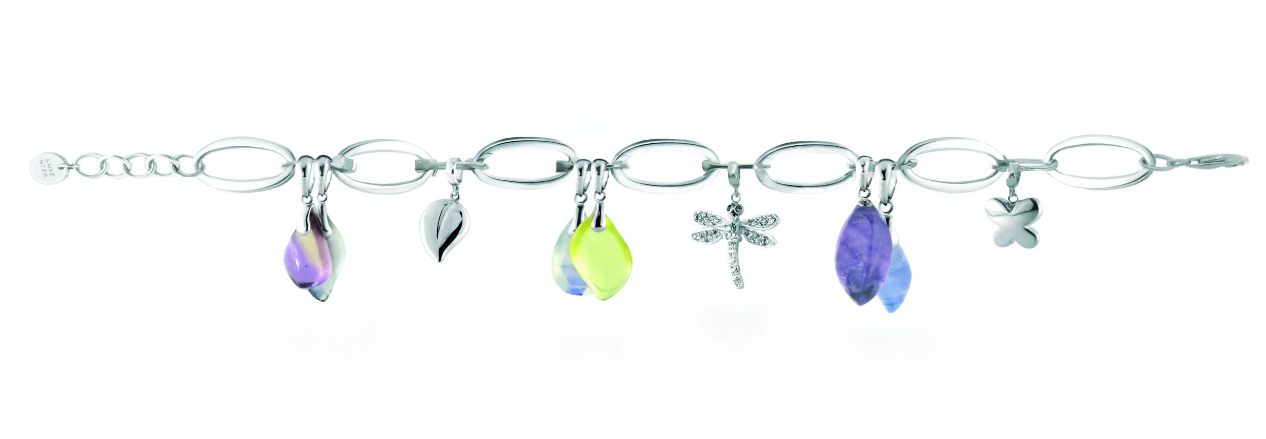
I was in charge for this collection, from the art direction coordinated together with the Brand’s marketing till the layout design for the gemstone’s catalogue, photography session of the jewellery and its later digital enhancement, coordination with the printer and overall layout design for it’s online and printed marketing usage.
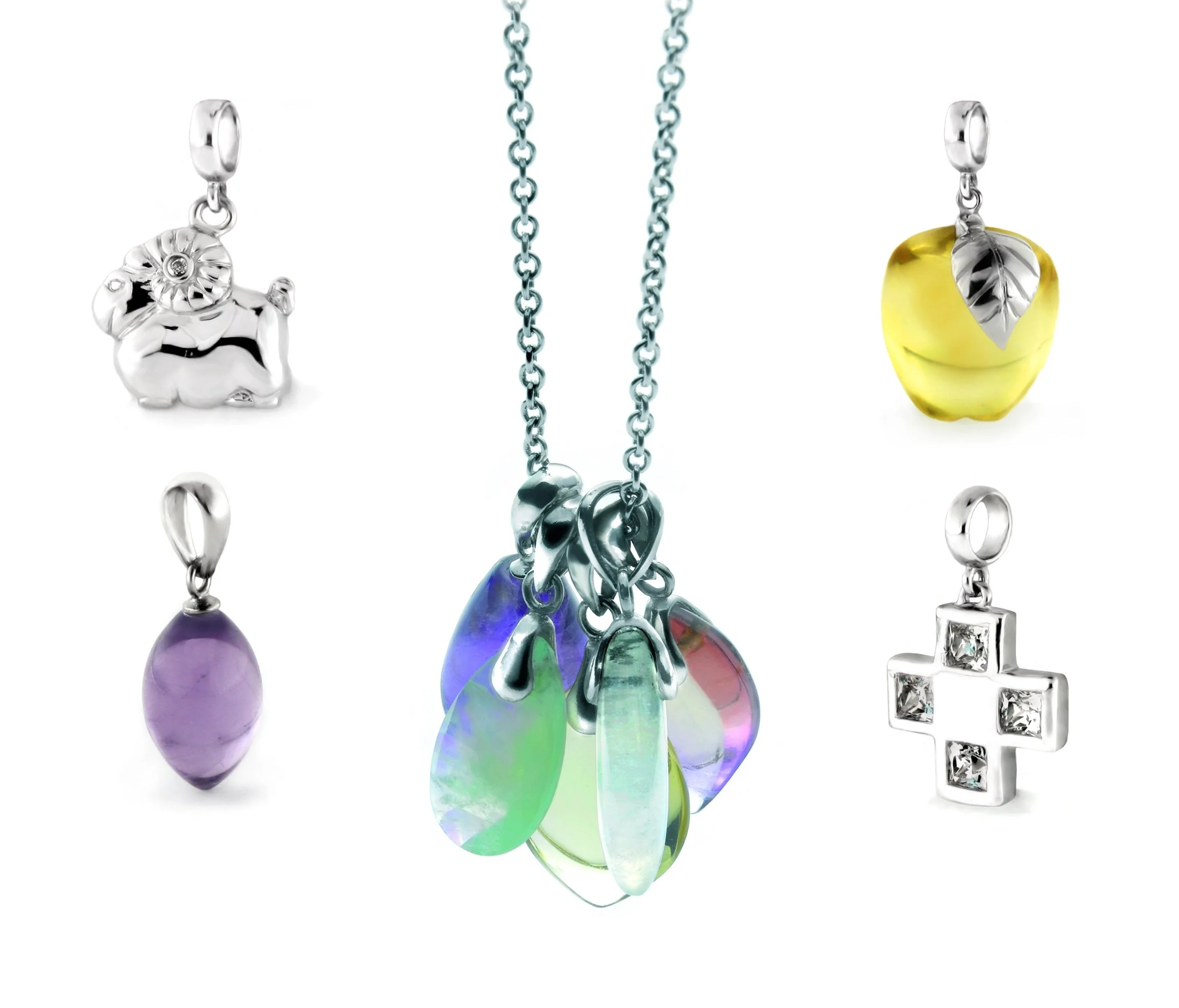
The “CHIC CHIC” catalogue
All what was previously photographed and enhanced, was later on applied into the layout of many promotional material and marketing communication both for jewellery events, the brand’s window design and eventually, clients.
Istockphoto
Varied works during the time I worked together with iStock (formerly exclusively known as iStockphoto). All these different works I personally directed artistically, implementing the existing design from the centralised office in Calgary, Canada at that time. As well, I designed, coordinated/managed and implemented full art direction for new campaigns, firstly in Berlin for then to be adapted to the local campaigns in Italy, Spain, France, Portugal, U.K., Japan, Singapore, Brasil, etc. The full visual communication, from online media to print, events booth’s design and printed materials, animations, and a large etc. I was in charge of coordinating myself between the different marketing teams of the aforementioned markets in different countries and printing-houses, logistics, budgets, etc.
Some examples of “white paper” documents, complete advertisement campaigns adapted to different markets, events, etc.:
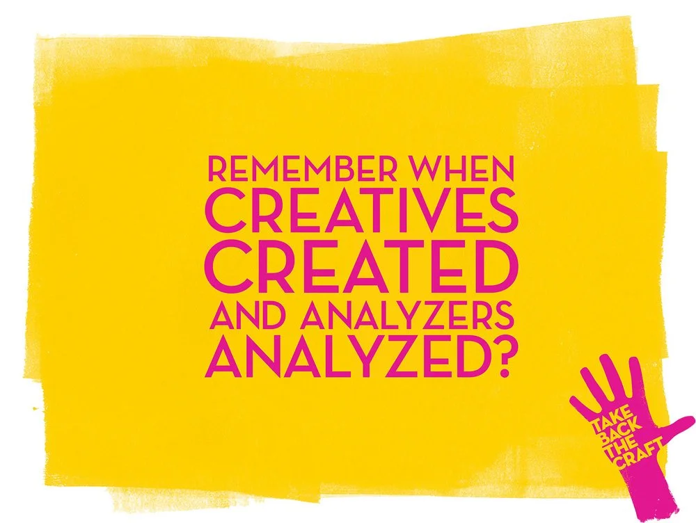
The colours used on the campaign were pure colours, saturated for indicating with a strong emphasis that it’s important to give Art its rightful place in design and creation processes.
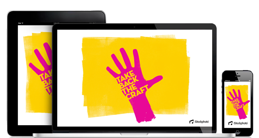
“take back the craft”
Adapted campaign into several different media, coordinated and managed with Getty Images and iStock offices in different countries. For example, in the german speaking region was renamed, “zeige was Design kann”.
Another “hero” image to be adapted into a large variety of formats and mediums.
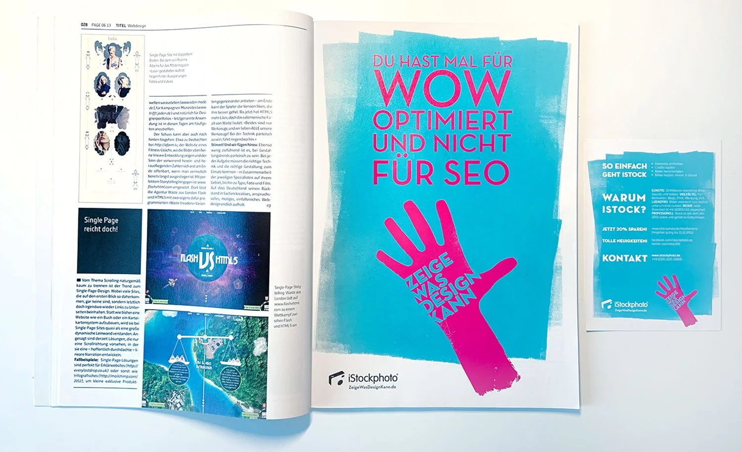
One example of the adapted campaign for the german speaking region. Locally printed flyer for a microstock media event and the ad in a popular german magazine, PAGE .
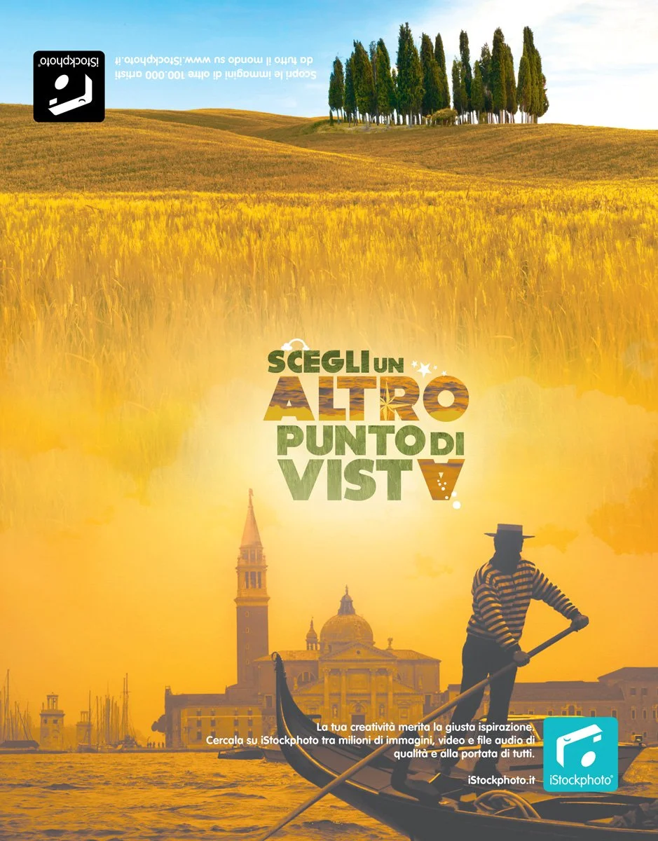
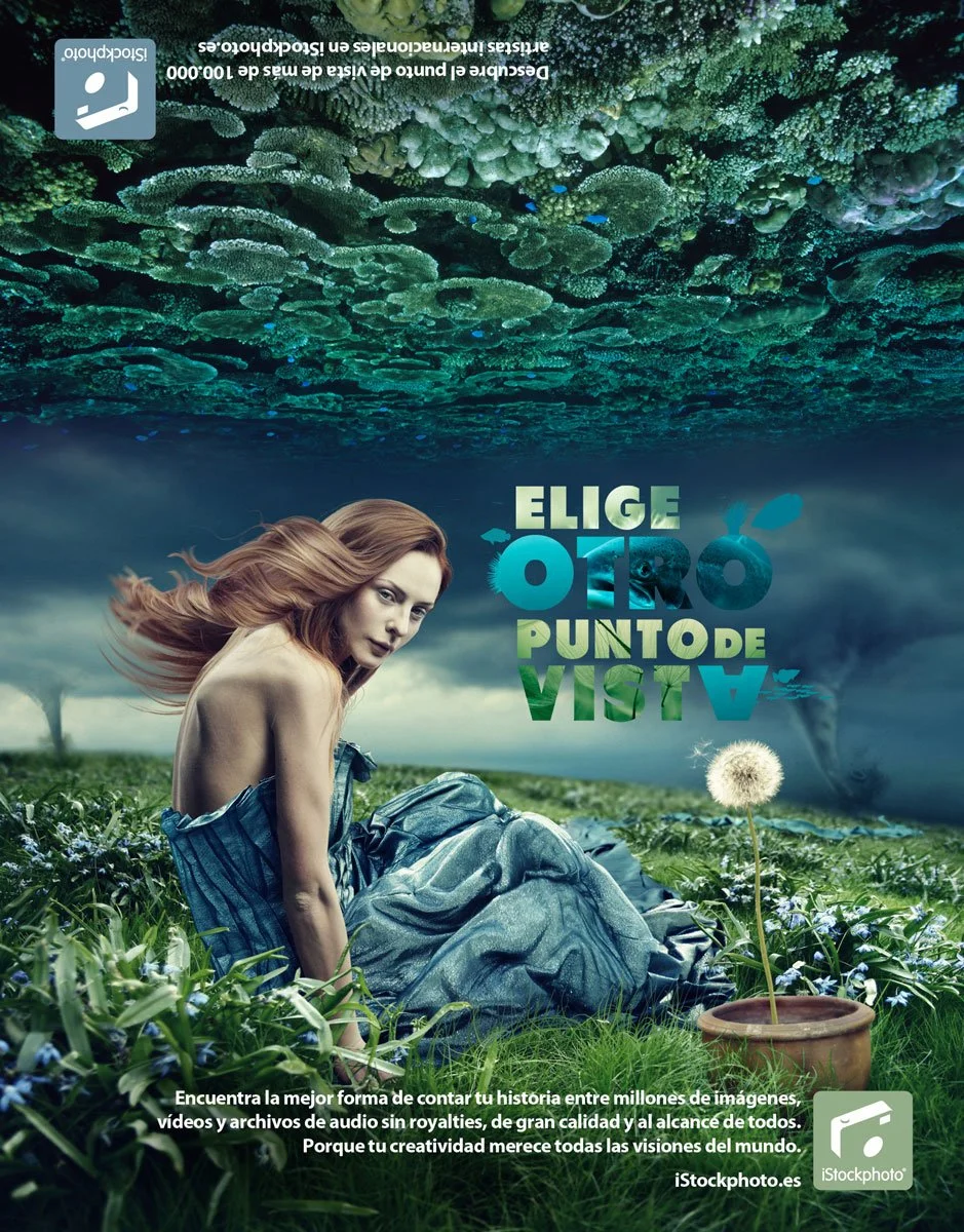
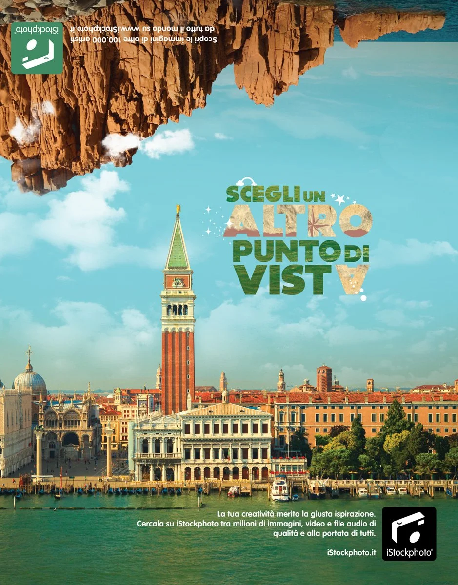
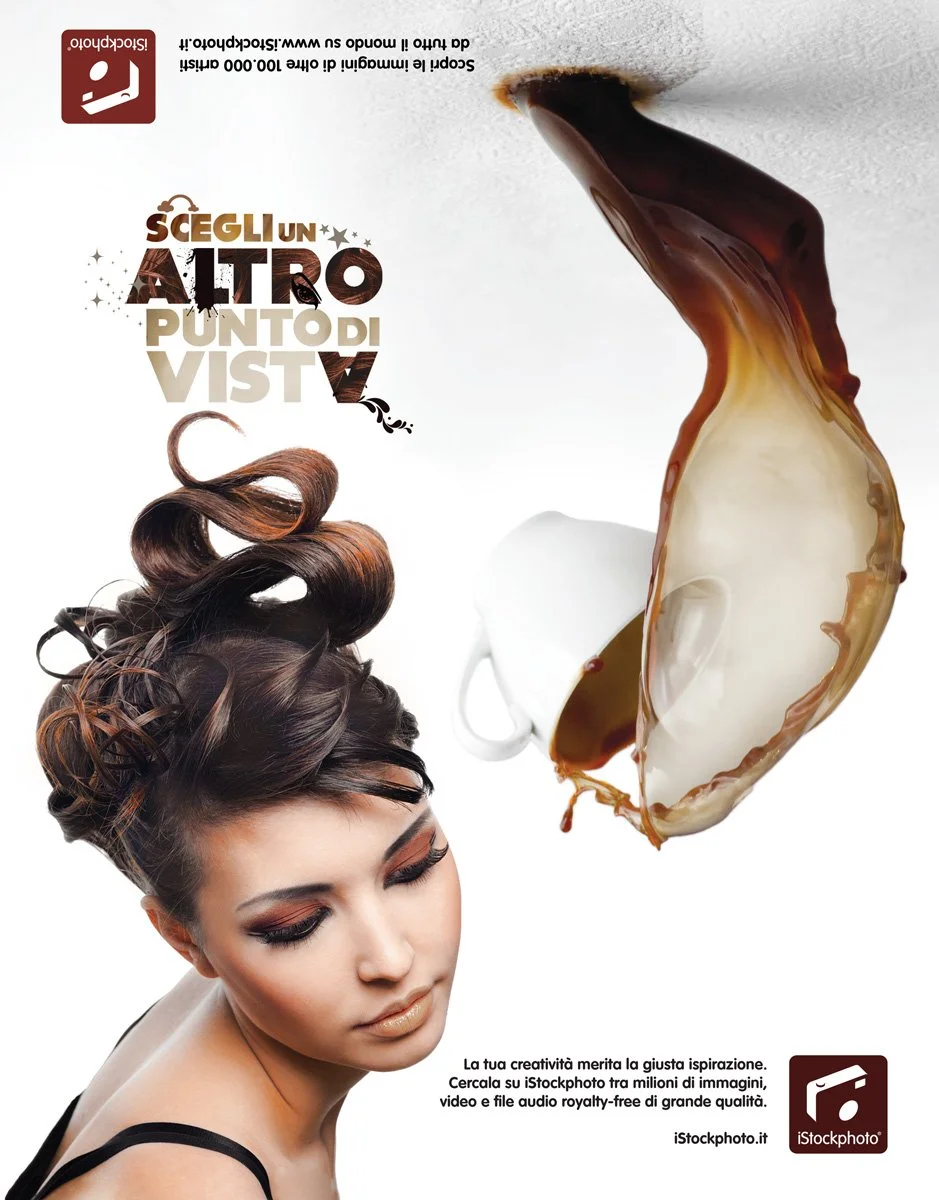
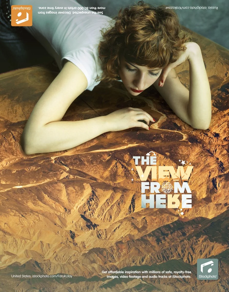
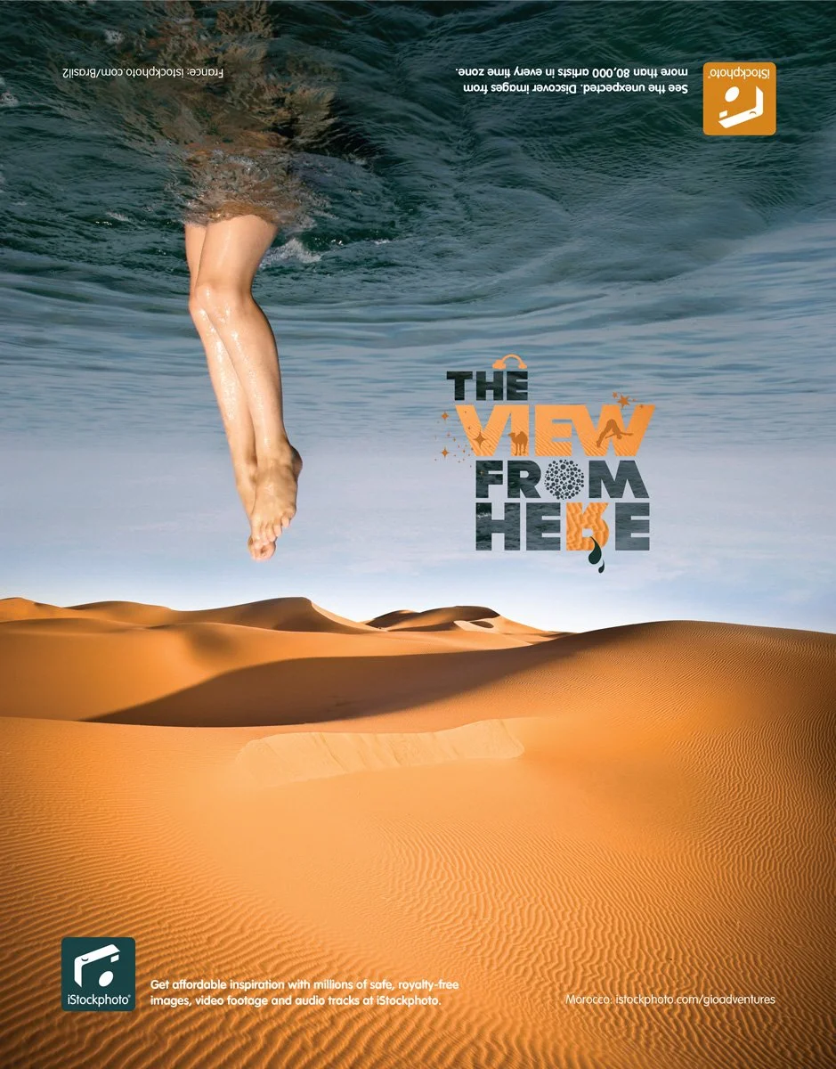
“The view from here…”
A campaign fully directed, designed, coordinated and adapted into other markets, including the Italian, Spanish and German markets among others, with the intent of showcase the very large possibilities and the creativity that goes along with it, through the usage of iStock’s media database.
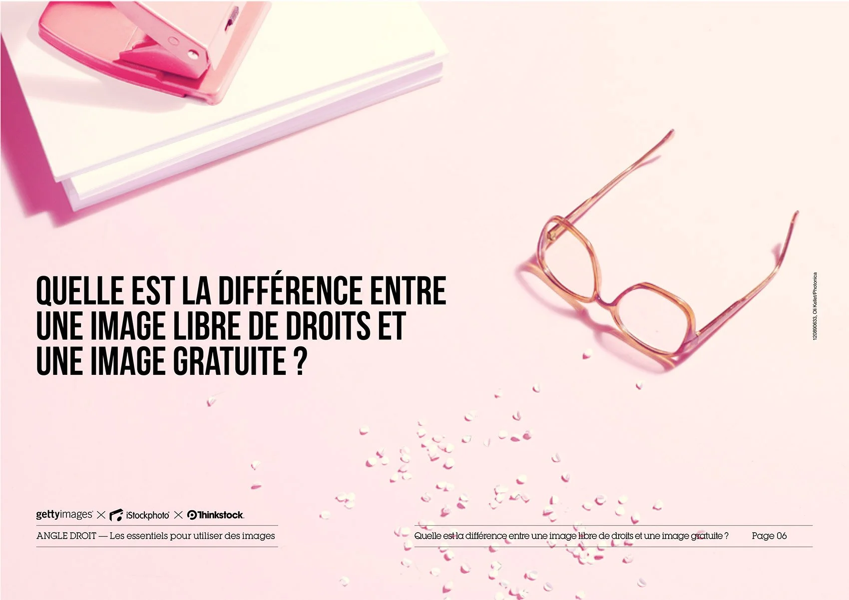
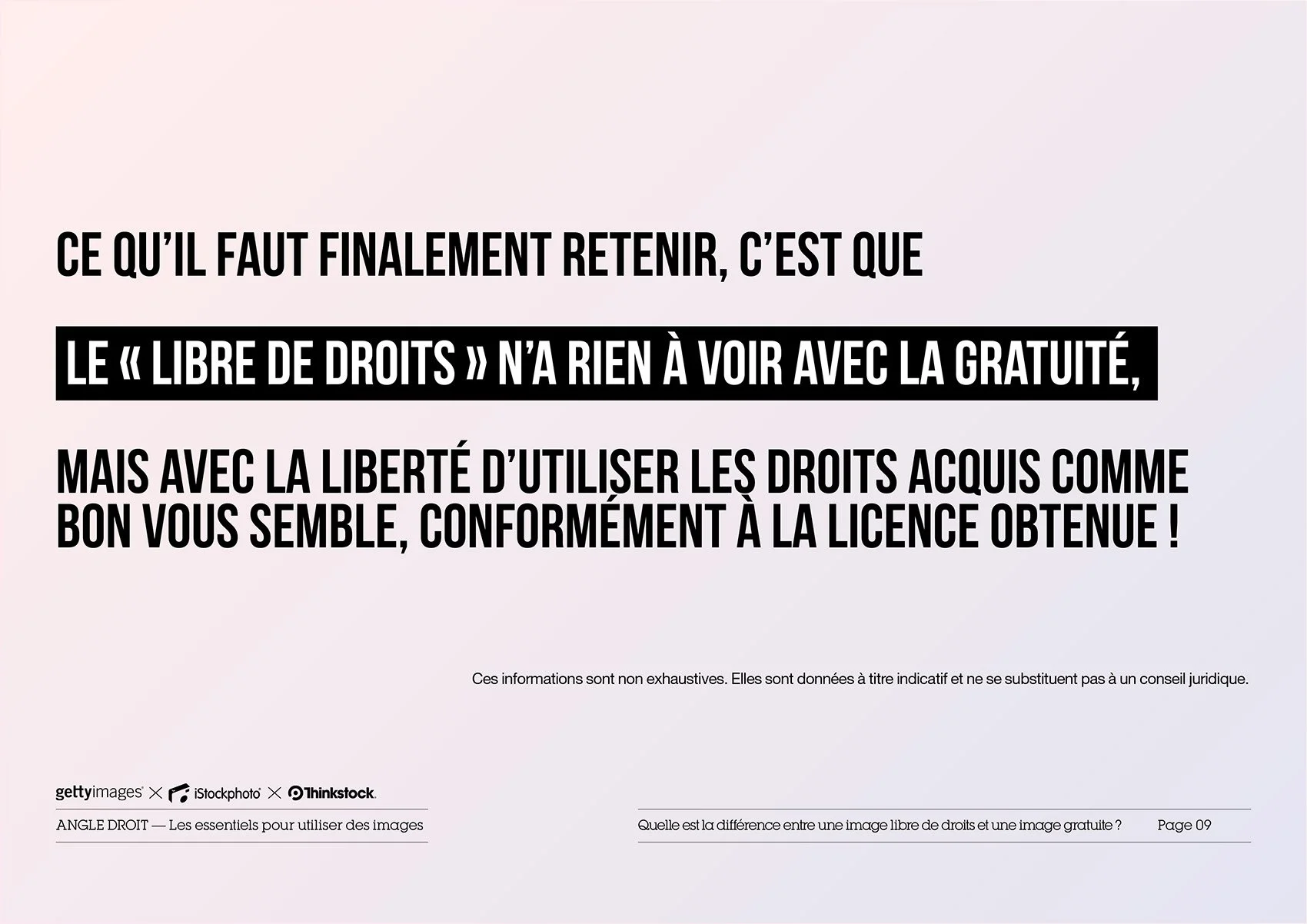
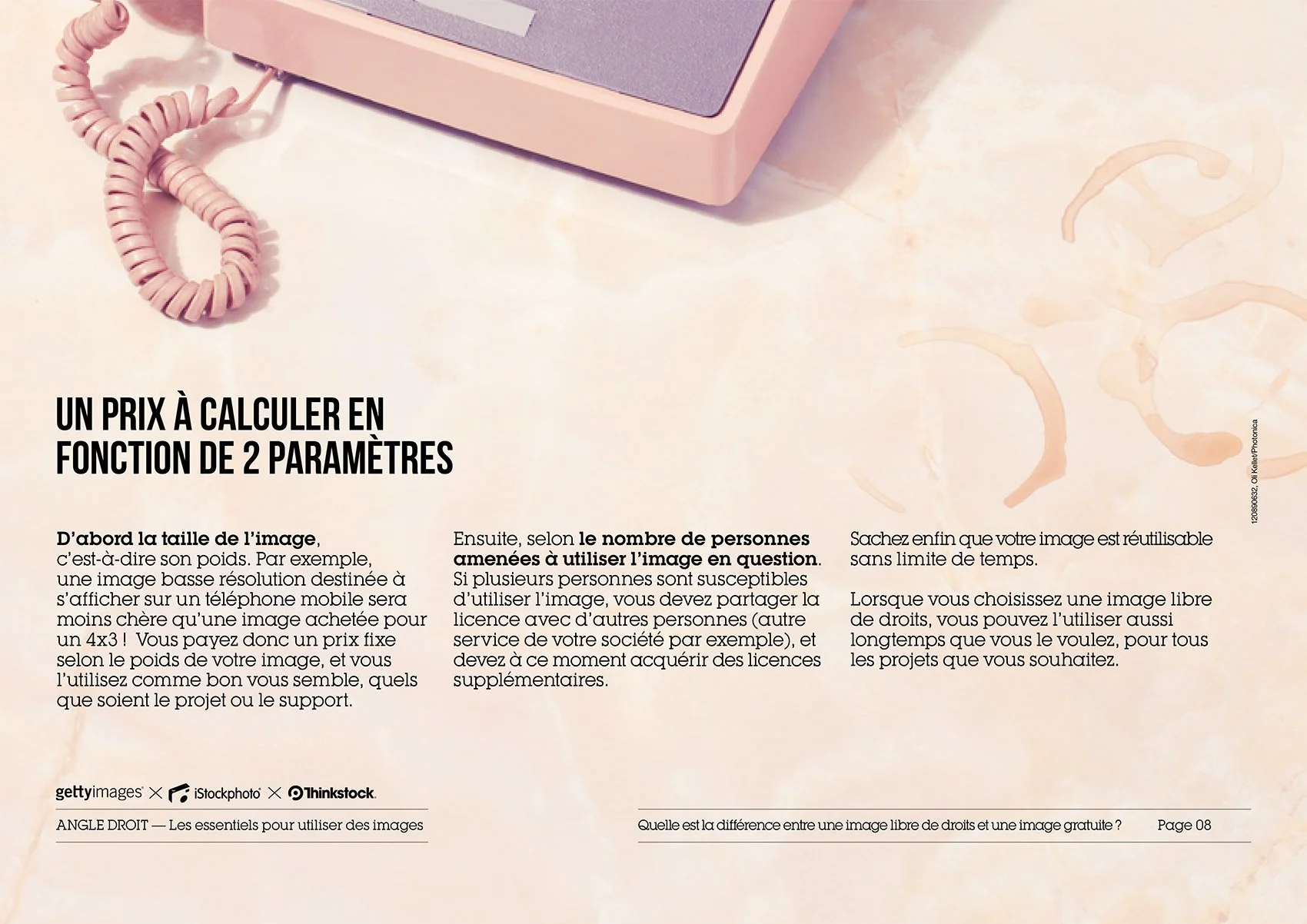
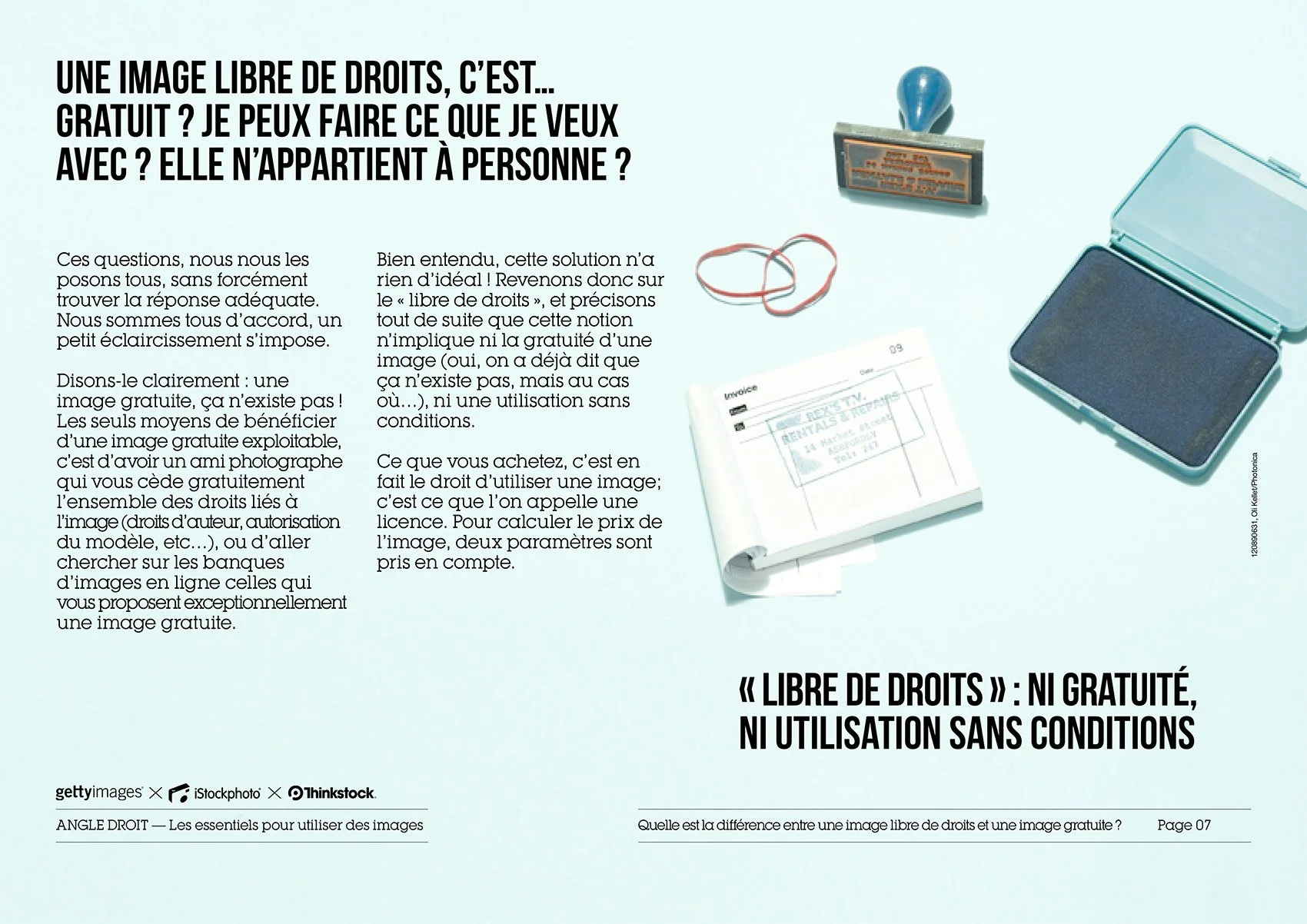
“iStockphoto Angle Droit”
A full document stating basic information concerning the world of copywright images within the enormous media platform that iStock has. Document worked with the french office of iStock at that time.
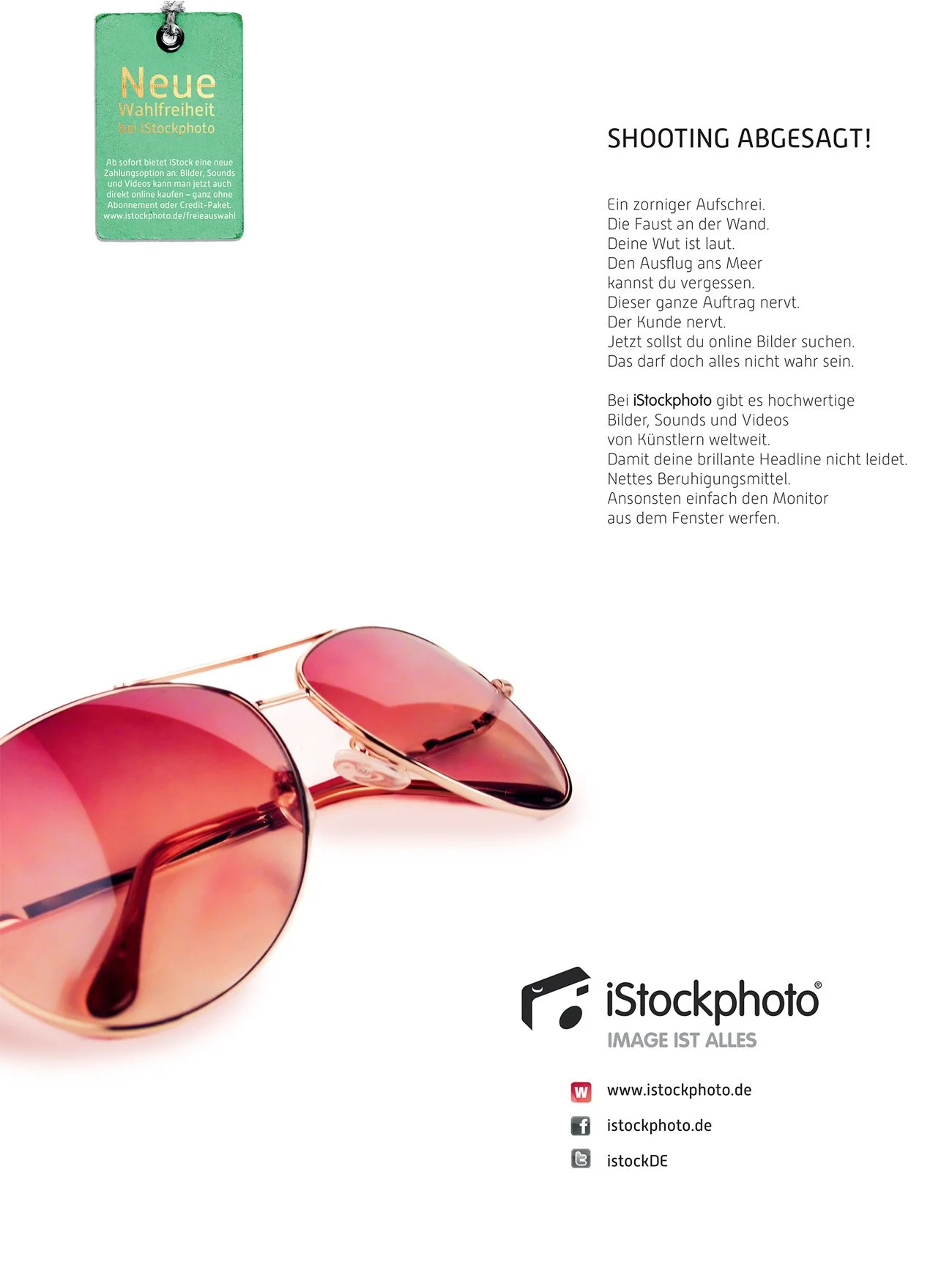
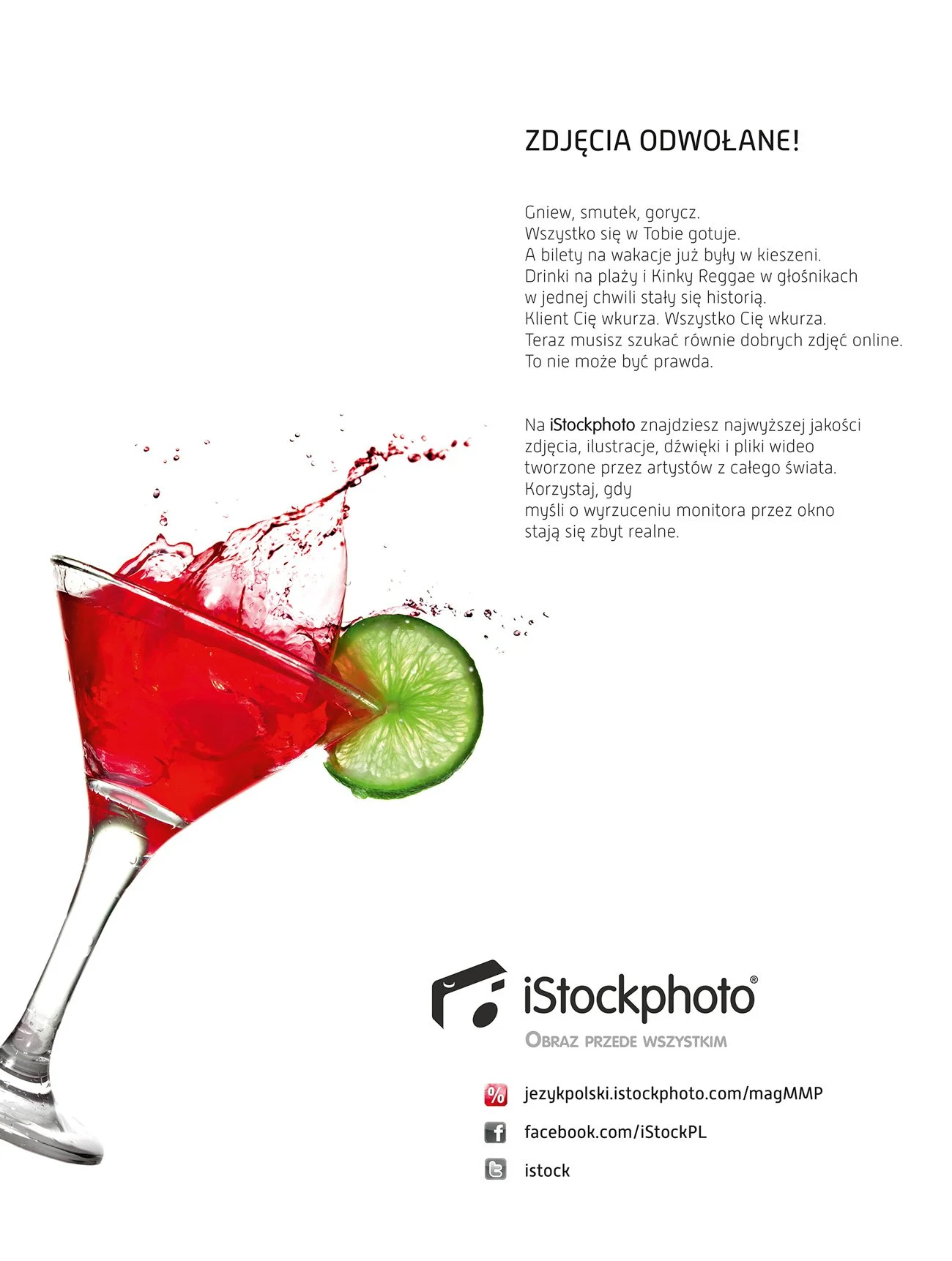
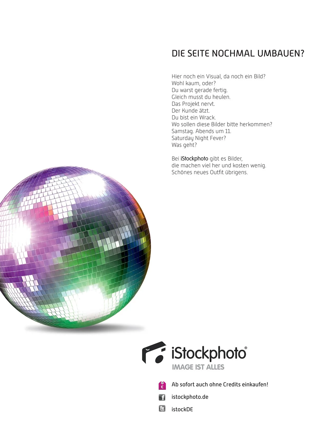
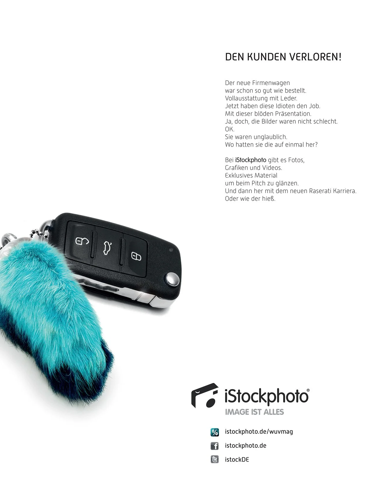
The “blank” campaign
In this marketing campaign, the idea was to have an isolated element, to make a bold but at the same time ironic statement, where the person seeing the ad can also see that even in situations where things go wrong, one can find very useful and “life saving” resources using the large media database from iStock. This campaign I directed, designed and adapted for different markets where iStock was present, like the german speaking market and as well as depicted here, the polish market.
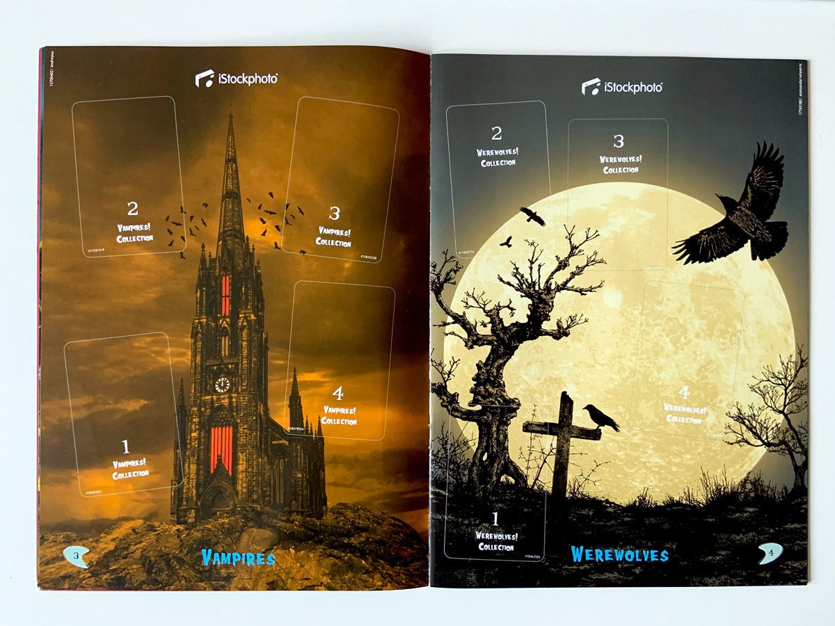
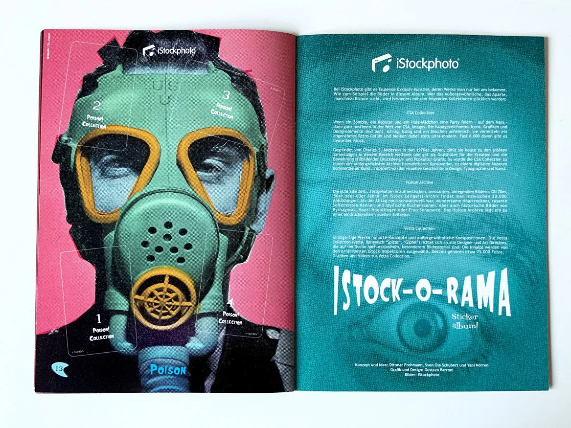
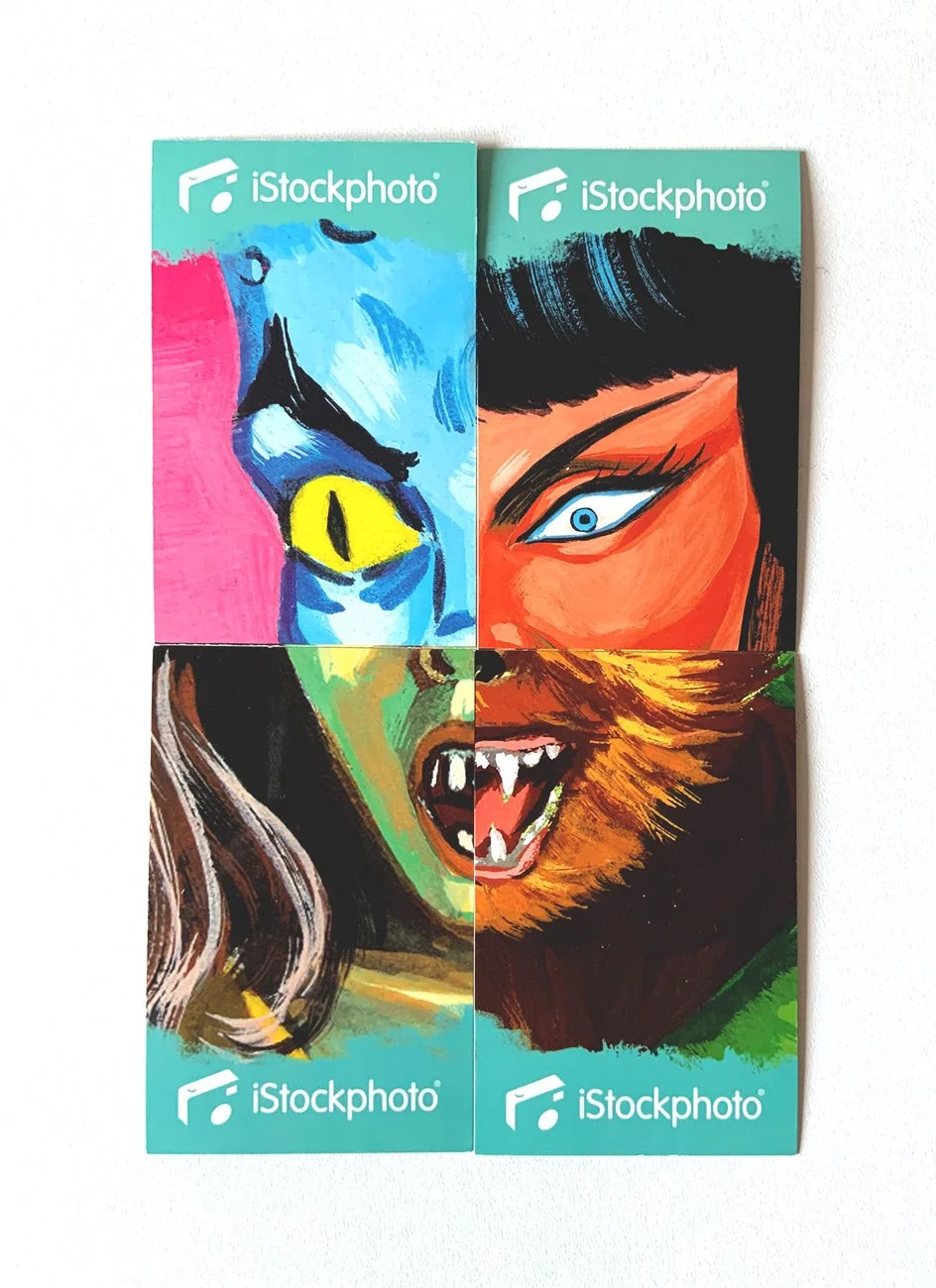
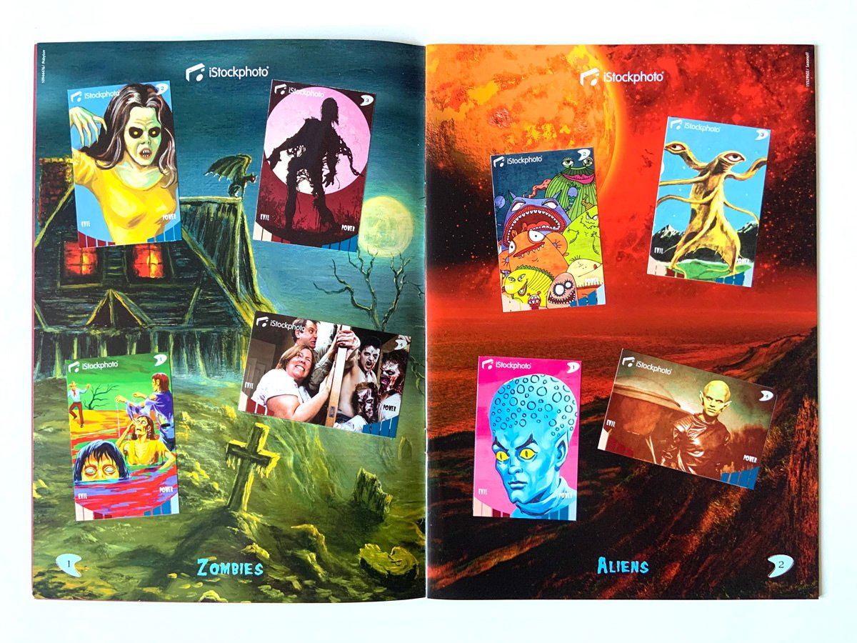
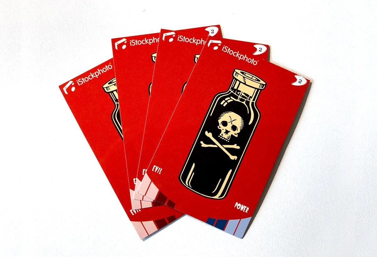
4 special stickers
These 4 stickers were specially created to form the same composition as seen in the album’s cover. Given to those who played the album’s game in the event.
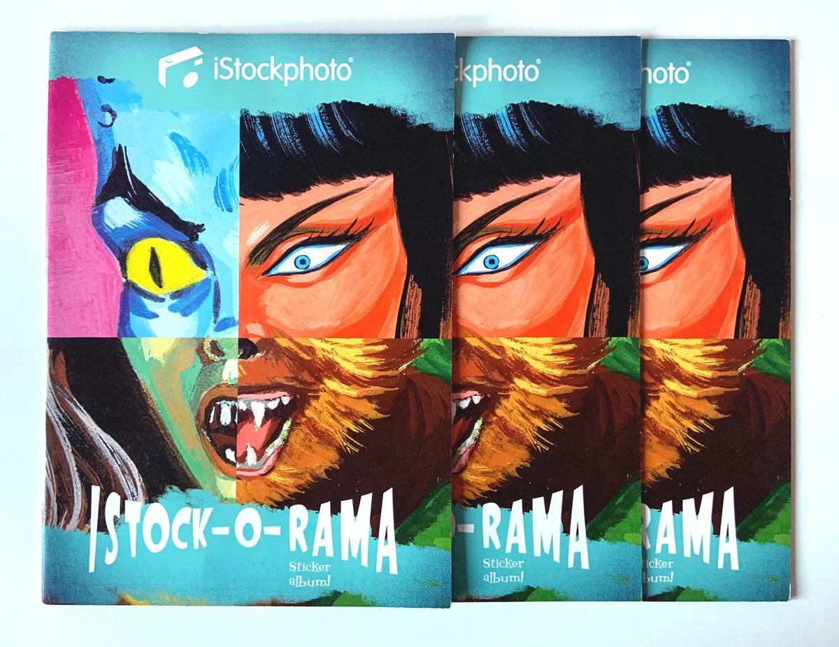
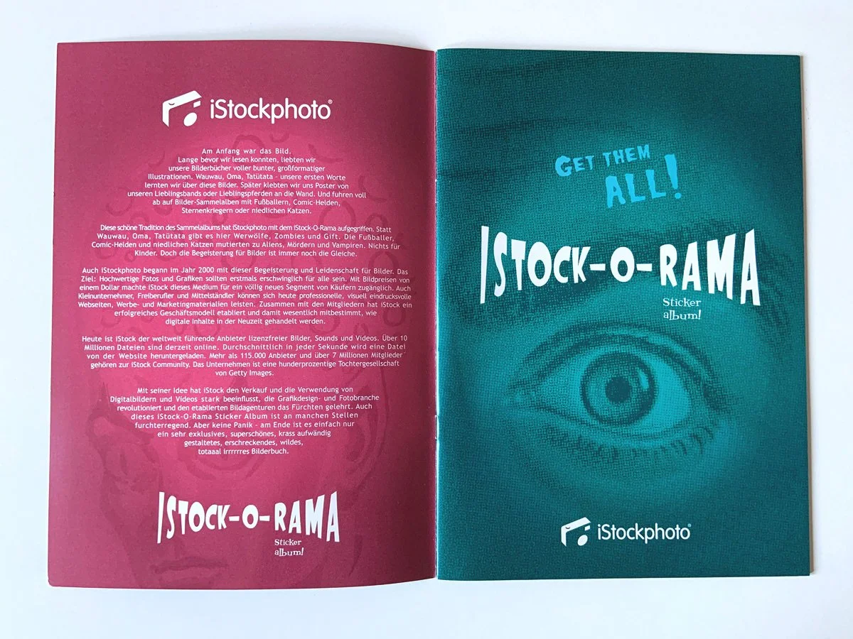
The sticker’s albums for the ISTOCK-O-RAMA ! campaign.
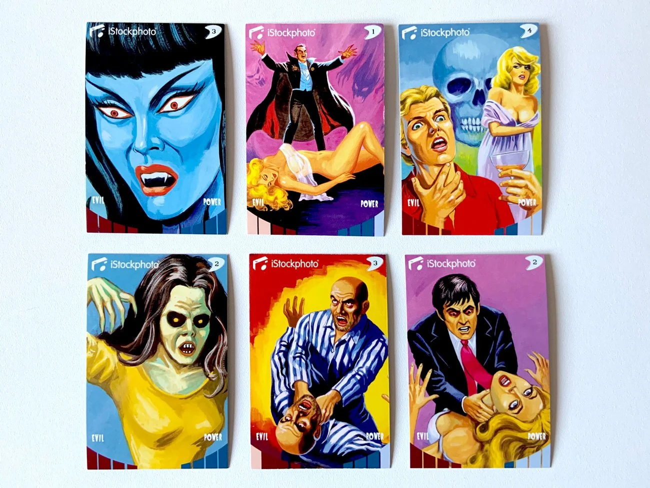
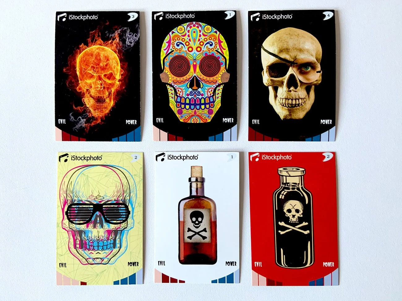
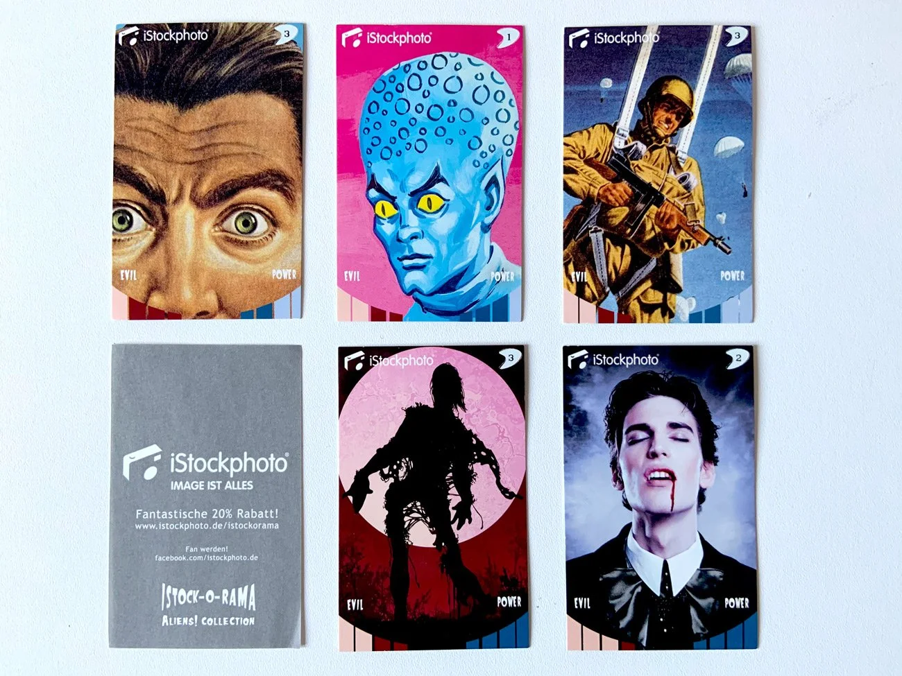
Some of the vast collection of stickers.
Each one displayed in the back to which collection they belonged to (“Poison”, “Weapon”, Vampire”, “Aliens”, etc). And each one had a measurement on “Power” and “Evil” on the front, under the image of the CSA Images Collection used for the sticker. In that way, people at the event could play and compete with each other and get all the stickers for the album. Other materials of promotion were also given freely to the attendees.
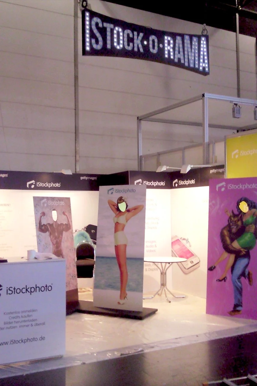
At the ISTOCK-O-RAMA booth. Used for different events across Germany.
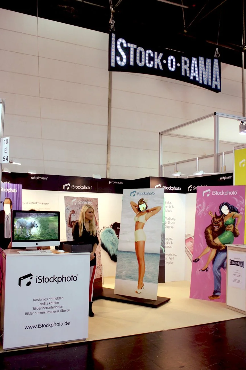
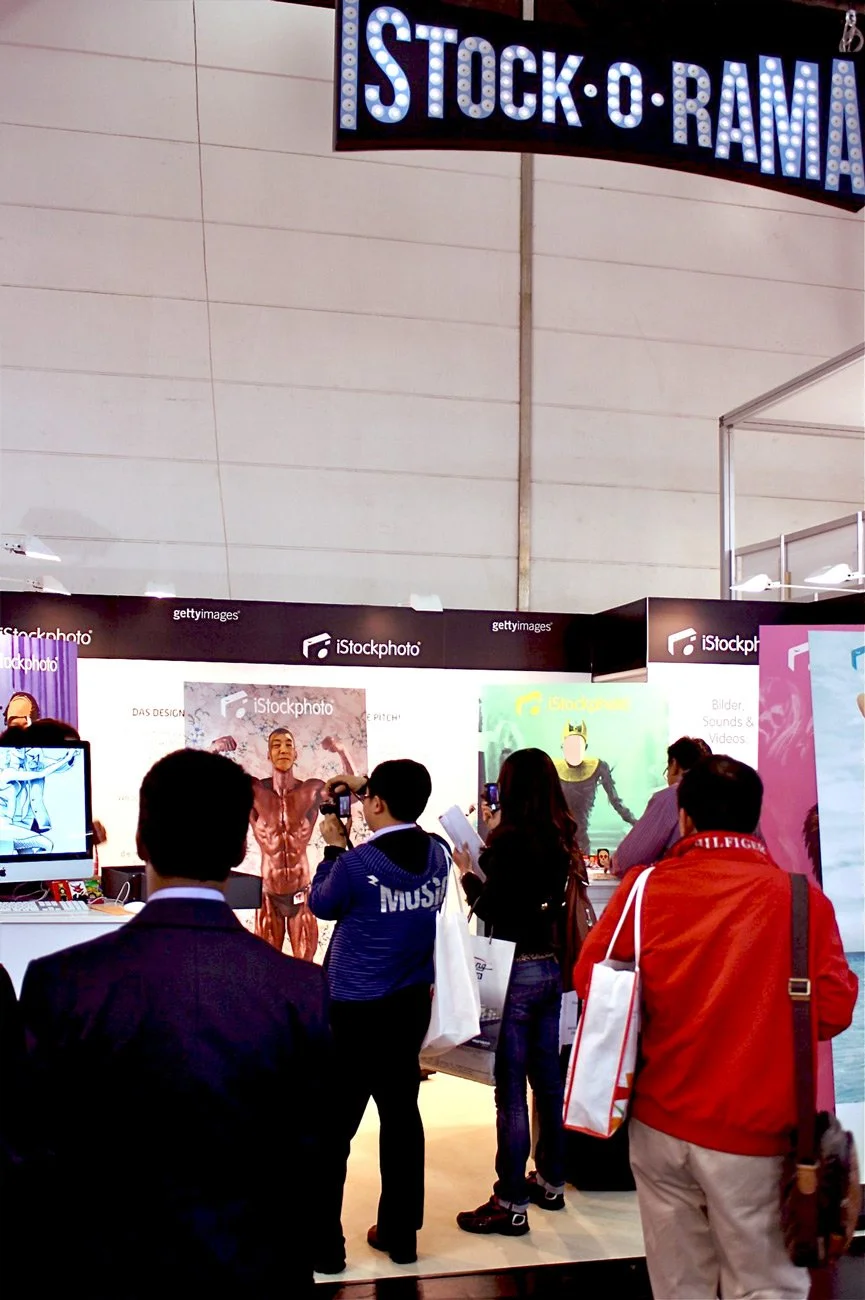
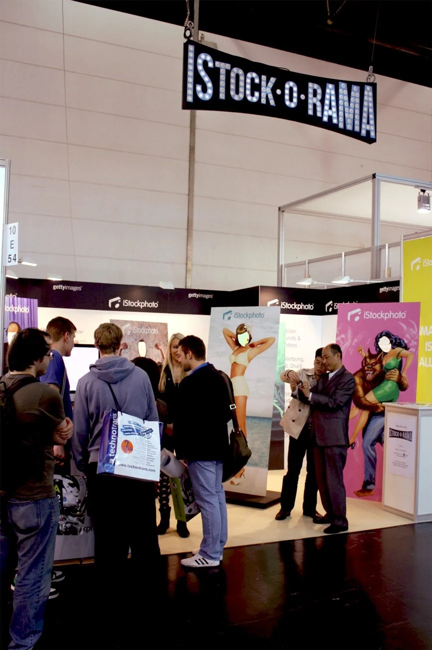
ISTOCK-O-RAMA !!!
One of the most fun multimedia campaigns I worked with, while working with iStockphoto. The whole art direction, design and illustration was intended to promote the new licensing partnership with Getty Images / iStock: the wonderful CSA Images Collection. This a very rich and large collection, specially versed in the world of vintage imagery and pulp art. We called it “ISTOCK-O-RAMA” and I coordinated and managed, besides the art direction of the sticker’s album play, the printing of varied materials such as the sticker’s albums and stickers, also designed a sign to be hanged at the event with lightbulbs and also cut-out figures from the CSA Images leaving the face space free for those who wanted to pose and take a picture of themselves. This campaign was also accompanied by the usual online+offline and promotional media. So much fun!
123RF & 500px
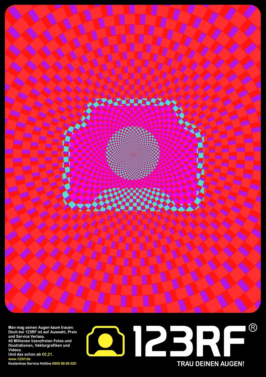
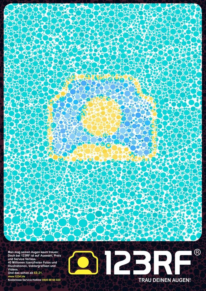
Some coordinated, designed and directed ad campaigns for these two companies. In both cases, the client wanted a bold statement, that would “catch” the viewer’s attention and bring their attention into the exclusive collection they both have. The idea also reflected clear corporate ways of visual communication which I helped to develop, using as a base what they previously had stablished, but expanding it.
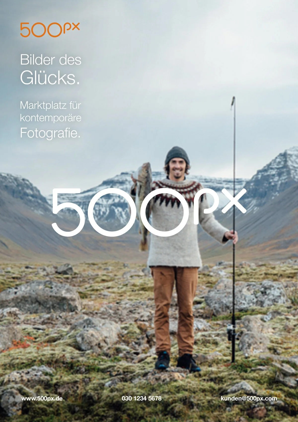
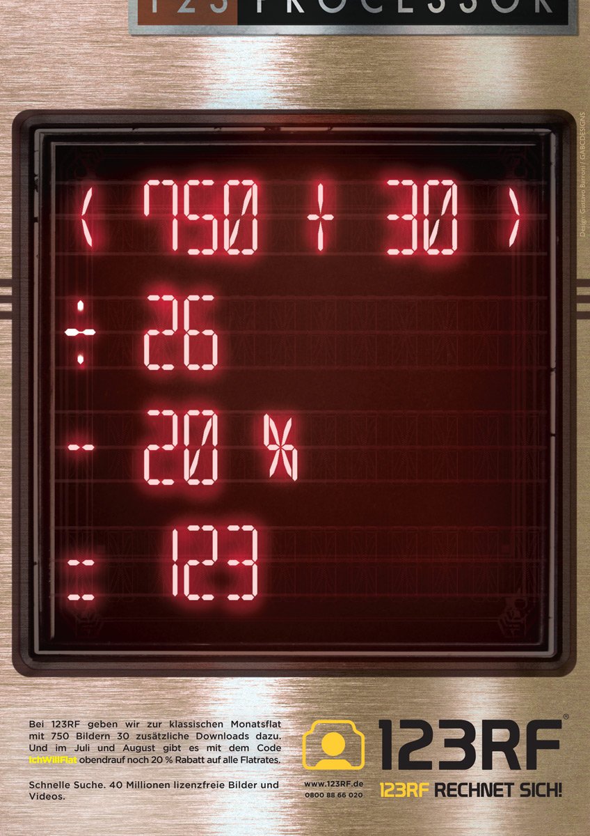
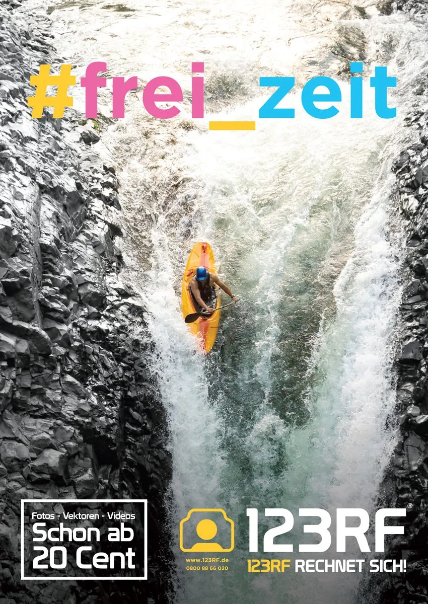
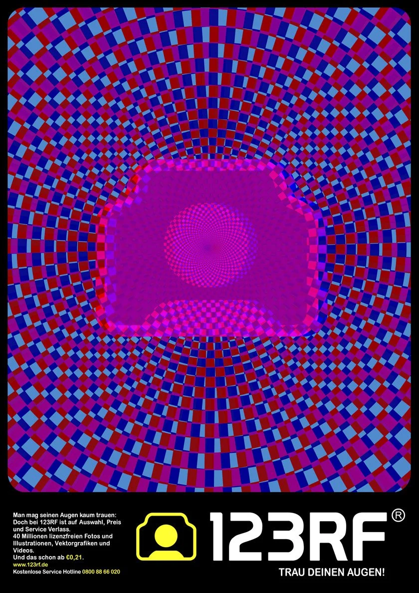
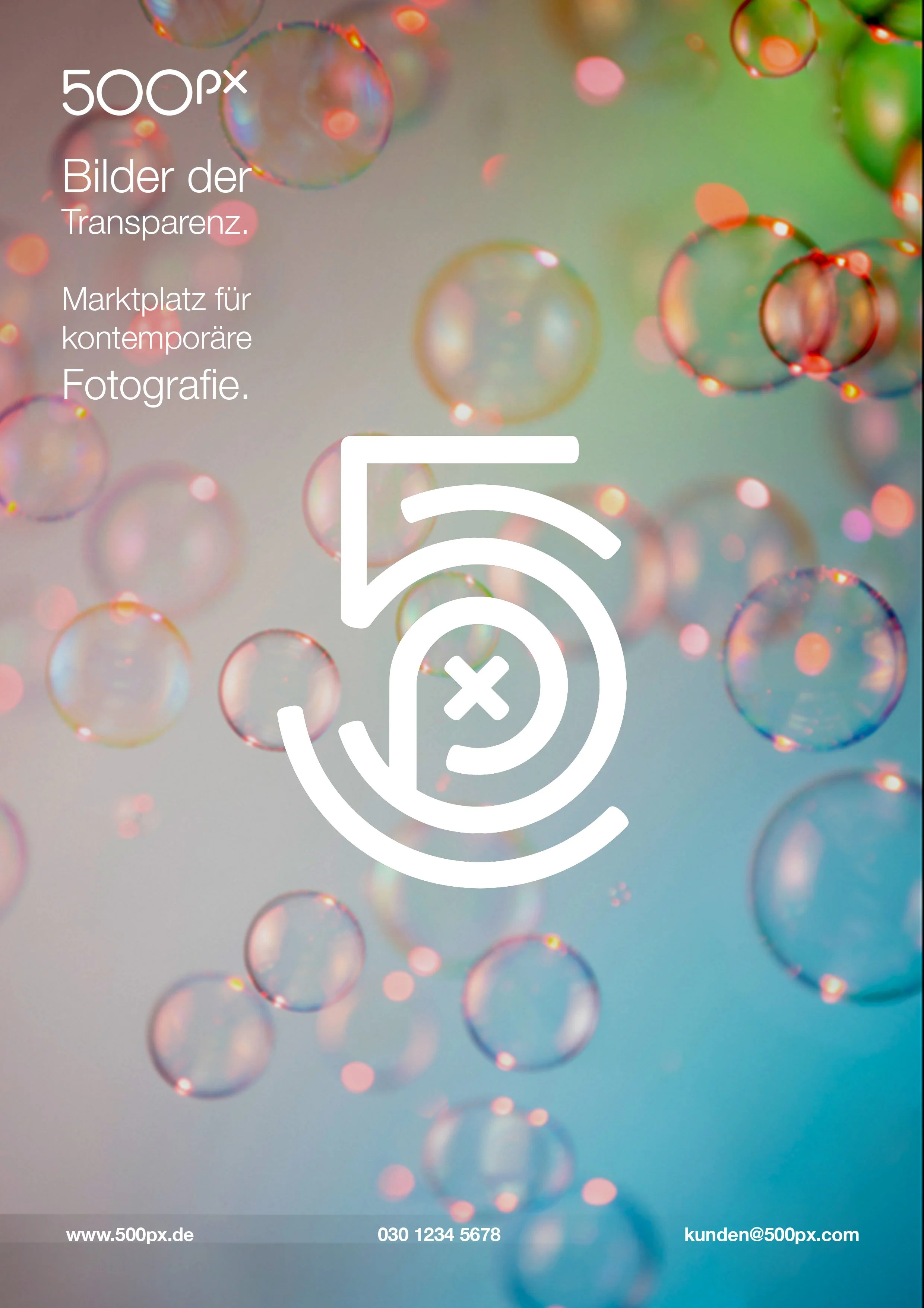
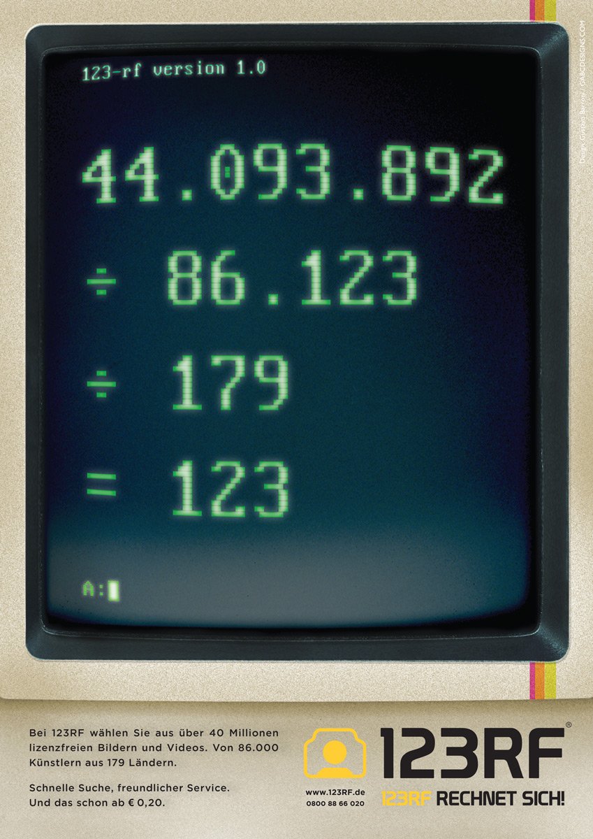
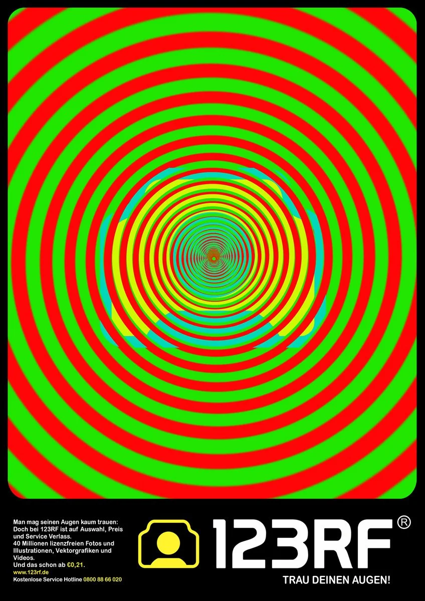
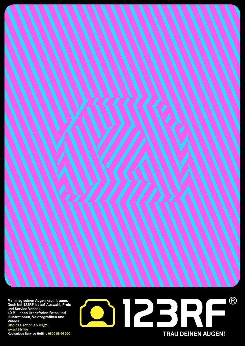
“Retina” & “New Maths” advertisement campaigns
This initial ad campaign was designed and directed for 123RF, with the idea of playing with different “optical testings” for the viewer/reader to form a stronger brand recognition. The second “New Math” campaign, was intended to show in clear details 123RF’s large media collection.

other works & collaborations

david bowie portrait
Commissioned painting used to illustrate an editorial magazine article about David Bowie.
Oils on hardboard panel.

THE PAUSE
Oils on canvas painting for a book
inspired on merfolk mythology.
MORE INFO
TIEMPO LIBRE
Some examples of commercial illustration, design and art direction while working at Tiempo Libre, a tourism company based in Madrid, Spain. I worked and closely coordinated different projects with them and their business clients such as Formula One, Iberia Airlines, AVIS, Four Seasons hotels, AIDA Cruises, Pullmantur, COSTA Cruises, etc.
IBERIA PLUS
Illustration done for the Iberia Plus Points Program, and its European market. Pencils + painted digitally and adapted for the final printed medium, magazines and newspaper. Layout as well designed and adapted.
FORMULA 1
Illustrated magazine ad done for a travel agency, Tiempo Libre. Work collaboration between the FORMULA 1 and the Circuit de Catalunya. Campaign later adapted into varied media supports for Tiempo Libre, originally designed and illustrated.
UP IN SMOKE
Cover art commissioned by "Throw the Dice Productions" for the Haunted comic book series.
Featured art direction for the title, cover layout, etc., for this publication.
ATMIKA, YOGA & MUSIC
Poster done for a yoga teacher and music artist. Pencils and digital painting.
Otherland Bookstore
The collaboration of different works with this Berlin science fiction/fantasy-specialised bookstore were quite thrilling!
I not only worked with one of the founders, author Simon Weinert on his novel which can be seen more in HERE , but also I creatively directed and coordinated a series of postcards for their bookstore. I personally directed, coordinating as well the publication and printing processes for this set of postcards which the idea was to reflect different Berlin’s landmarks but with a twist in the genres of science fiction and fantasy which is what this unique bookstore is specialised on.
Painting, “After Alexanderplatz”, a part of a commissioned Postcard series art directed and coordinated together with Otherland Bookstore, featuring Berlin landmarks as motive and mostly themed around the Fantasy and Science Fiction genres.
Original: Oils on canvas, 60 cm. x 50 cm. From my Retro Pulp Series, more INFO HERE
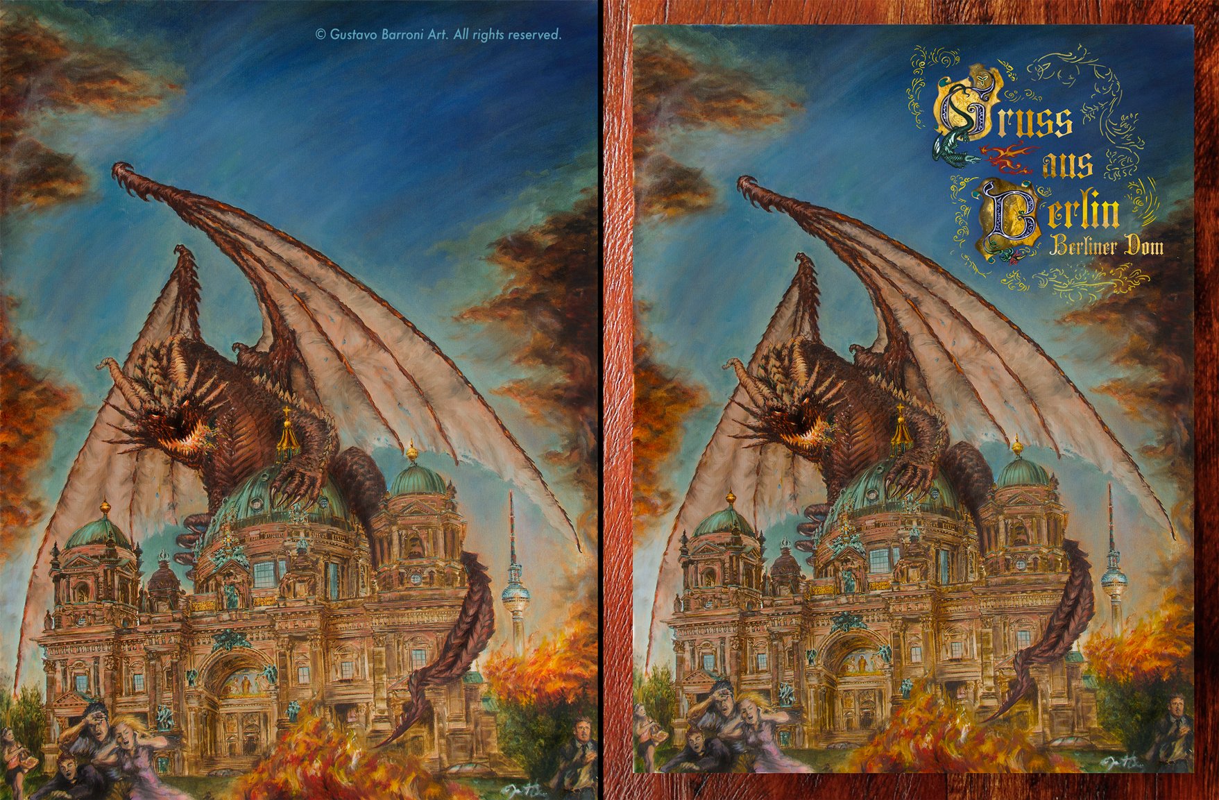
Original artwork, “Attack on the Berliner Dom”: Oils on canvas 80 cm. x 60 cm.
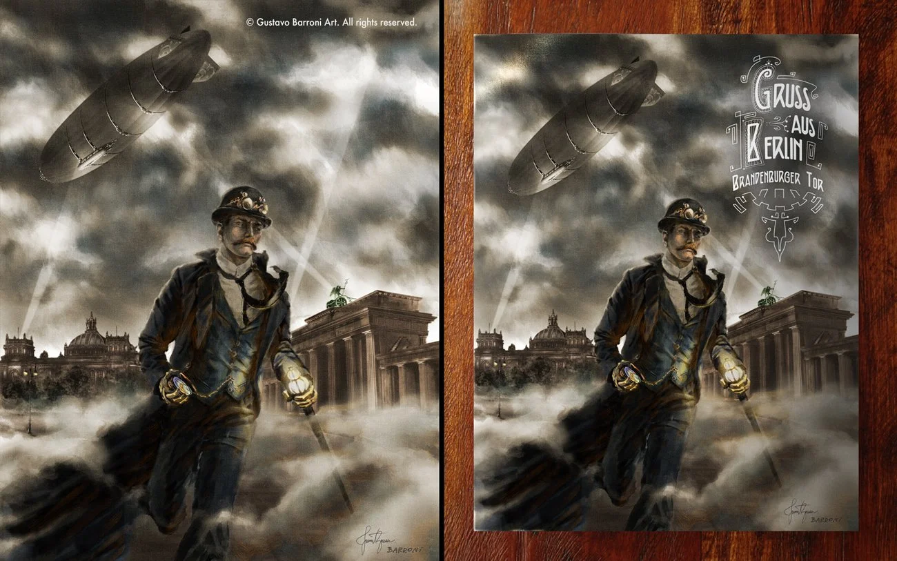
The comparative images with my original artworks and their adaptations into the thematic postcards. The clear reference to the steampunk and fantasy genres was a clear nod for this specialised bookstore.
Original: digital painting worked from an original pencil drawing.

The 3 Postcards done with Berlin famous urban landmarks serving as a background for the specialised Sci-fi/Fantasy Otherland Bookstore . More of this project, HERE.
Stock Unlimited
I coordinated, designed and fully illustrated this campaign for Stock Unlimited, which used as well different renditions of my personal work “The Last Try” which belong to my Retro Pulp Series. For more info on this project and my Retro Pulp Series, please click HERE.
The Last Try
Original painting from my Retro Pulp Series.
Oils on canvas paper

Animated banner for the campaign “YOUR FUTURE IMAGE” for Stock Unlimited.
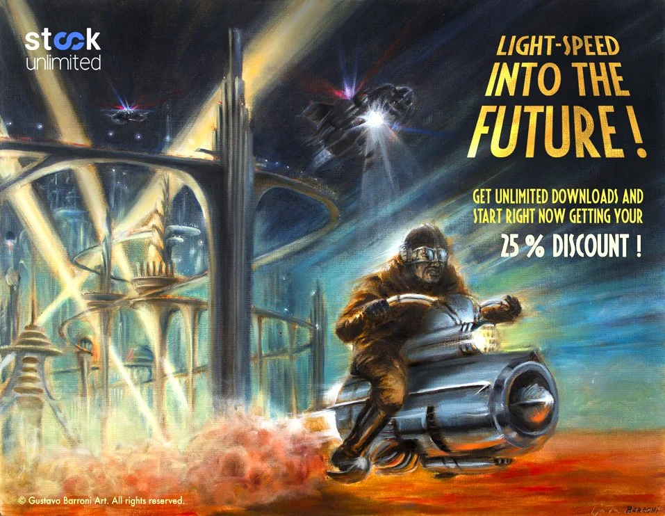
Stock Unlimited ad
The ad was coordinated with the client, using my artwork as a base. This image and other variants were used for through different marketing channels, including magazine ads, online communication, newsletters, etc.

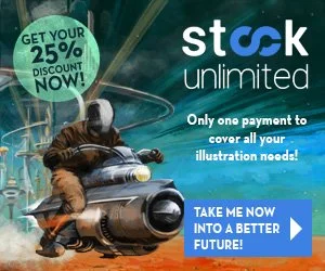
Static banners that also were part of this marketing campaign for Stock Unlimited.

BURNING TARGETS
Poster worked as a concept which was commissioned for an independent film project.
From my Retro Pulp Series, INFO HERE.
Oils on canvas / 50 cm. x 40 cm.

NATURAL CONNECTION
A painting commissioned for a book about robots by the editorial The Art Order.
Oils on canvas mounted on wood panel, 40 cm. x 30 cm.
THE FINDING
Commissioned digital painting.
Composition and character created and presented for a tabletop game project.